Time-to-Value Measurement for Individual Feature Adoption
Measure time-to-value at the feature level, not the product level.

Time-to-value is usually reported as one number for the whole product. That number is close to useless, because a product isn't one thing users adopt, it's a bundle of features, each with its own learning curve, its own friction points, and its own definition of "working." Measure TTV at the feature level, with a real activation event and a clock that starts at the right moment, and the metric turns into something you can actually act on.
What TTV actually measures, and the four terms that get conflated
Four concepts get used interchangeably in most product meetings, and they shouldn't be.
Time to First Value (TTFV) is the moment a user first perceives that the product (or a feature) does something for them. It's a felt experience, so teams approximate it with a measurable proxy event: an export downloaded, a report generated, a dashboard populated with real data.
Time to Core Value sits one layer deeper. It's when usage shifts from a one-off event to a pattern, the kind of pattern that predicts a renewal ten months later.
Activation rate answers a completely different question. Activation rate measures volume: what fraction of users ever reach the value event, regardless of how long it took them.
The aha moment is the emotional core that produces this, the point where a user decides the product is worth keeping. Nobody instruments an emotion directly, so the activation event is a stand-in for it, and a decent one only if it's chosen carefully.
A Userpilot report covering roughly 547 companies, cited in the digitalapplied.com 2026 framework, puts median TTV across B2B SaaS at around a day and a half. But that median swings wildly by category, so treat it as context, not a target to hit.
The distinction that matters most at the feature level is activation versus adoption. Activation is the first successful use, first export, first query, first invite sent. Adoption is repeated use that keeps delivering value over time. A feature can activate beautifully and still get abandoned within a week. Activation problems are about onboarding and friction, while adoption problems are about whether the feature's recurring value keeps delivering over time.
Defining a valid activation event for a specific feature
Before any clock starts, someone has to answer one question honestly: what single action, if a user completes it, reliably predicts they'll keep using this feature?
RevenueCat's framework, cited in the digitalapplied.com 2026 report, lays out three tests an activation event has to pass:
- Users who hit the event retain meaningfully better than users who don't.
- That retention gap holds up across segments, not just in one aggregate chart.
- Making the event easier or faster to reach actually moves retention numbers, not just completion numbers.
Fail any of those three tests and the event isn't activation, it's compliance. It tells you a user clicked through a screen, not that they got anything out of it. "Viewed the feature tour" is compliance. "Completed the setup checklist" is compliance. "Created a first export and downloaded the file" might be real activation, if the retention data backs it up. "Ran a first custom query that returned results" might be real activation too, for the same reason.
The definition has to be specific enough to instrument as a named event with a timestamp and a boolean outcome, not a fuzzy milestone somebody eyeballs in a spreadsheet. For an analytics platform, Countly's 2026 material defines activation as installing the SDK, receiving live events, and opening a first dashboard. Those three actions are specific to that product. There's no universal checklist that transfers from one company to the next. The right actions have to be validated against actual retention data, not assumed because they felt like the obvious "first step."
This work happens before the clock starts, not after. A poorly defined finish line makes every downstream measurement meaningless, no matter how precise the timestamp logging is.
Starting the per-person clock correctly
TTV for a feature does not have to start at signup. Picking the right start moment for a specific feature is where most measurement setups quietly go wrong.
There are two real candidates for a start event:
First eligibility, the moment a plan or role grants the user access to the feature. First exposure, the moment the user actually encounters some in-app signal about it, an announcement banner, a tooltip, a first click into the feature's screen.
Pick eligibility and TTV for a feature buried three menus deep will look artificially long, because the clock is running the whole time the user simply hasn't found it. Pick exposure and the clock hides that same discovery friction entirely.
The right choice depends on the question being asked. "How long does it take a user to find and activate this feature?" needs eligibility as the start. "Once a user discovers the feature, how fast do they get value from it?" needs first exposure. Userpilot lays out the calculation as straightforward once "first exposure" is defined concretely: subtract the exposure timestamp from the activation timestamp, for each user, then average across the cohort.
Averaging is where things get flattened out, though. A bimodal distribution, one cluster adopting in an hour and another cluster taking three weeks, means two different user situations are being mashed into one mean that describes neither. The point is a simple one: an enterprise rollout that legitimately takes weeks and a self-serve SMB flow that should finish in under a week will average out to a number that's wrong for both groups. Segment by role, plan tier, and onboarding model first. Average second.
The right denominator: eligible users, not total signups
A formula that appears constantly and is wrong almost every time: feature adoption rate equals users who used the feature divided by total signups.
That denominator is bloated with people who were never in a position to adopt anything. Free-tier users who never had access. Churned accounts that left the product before the feature even launched. Dormant logins that haven't opened the app in six months. None of them belong in the denominator, and including them makes every adoption number look worse than it is.
The corrected version, from meltingspot.io's 2026 framework, is: users actively using the feature in the period, divided by total users eligible to use the feature, times 100. "Eligible" means three things at once: on a plan that includes the feature, active within the measurement window, and in a role or configuration where the feature actually applies to their workflow.
Once the denominator is fixed, benchmarks start meaning something. One industry analysis puts average core feature adoption at 24.5% in 2025 data, with the top quartile clearing 45%. Countly's 2026 material shows a feature might have 40% adoption overall while being just 8% among the highest-paying enterprise segment. Blend those two populations and the number tells you nothing useful about either one.
There's a practical wrinkle too. If a feature is gated by plan or role, the eligible cohort shifts the moment plans change. That means the denominator has to be recalculated at the start of every measurement window, never carried over from the last one. And the same eligible-cohort logic decides who should get product guidance in the first place: pitch a feature to someone who isn't even eligible for it, and that's not helpful nudging, it's noise.
The four dimensions of feature adoption and when to use each
Adoption is four numbers, each pointing at a different lever. It's four, and each one points at a different lever.
Breadth, the adoption rate itself, measures what fraction of eligible users activated at all. It's the entry-level signal. Low breadth usually means a discovery or relevance problem, not a quality problem with the feature itself.
Speed, time to adopt, measures the gap between first exposure and first meaningful use. It is widely treated as the most precise available indicator of friction sitting between awareness and activation.
Depth measures how much of the actual valuable workflow each adopter completes, successful outputs produced, objects managed, advanced steps reached. A user who activates but never gets past step one has shallow depth, and that's a different fix from a discovery problem.
Duration measures what share of the adoption cohort keeps using the feature in later comparable periods. Saasfactor.co reports that features achieving repeat usage within the first 7 days see 90-day retention rates several times higher than features where repeat engagement lags.
That duration number needs a caveat, though, and it's an important one. A quarterly security review or a disaster-recovery feature isn't supposed to get touched weekly. Demanding weekly repeat use from a feature that's only relevant once a quarter punishes a product that's working exactly as intended. For low-cadence features, the better measures are eligible opportunities actually used, successful outcomes, and failure rate, not raw frequency.
Amplitude's cited 7% rule, from the digitalapplied.com 2026 framework, found that products where at least 7% of a cohort returns on day 7 land in the top quartile, and roughly 69% of the strong day-7 performers were still strong at three months. Early return frequency turned out to be the strongest predictor across time in that dataset.
Each dimension needs its own fix. Breadth problems get solved with rollout and placement changes. Speed problems get solved by stripping friction and improving guidance. Depth problems mean the workflow itself is incomplete or confusing. Duration problems mean the recurring value proposition, or the cadence expectation, needs rethinking.
Stage-loss diagnosis: finding where the cohort actually drops off
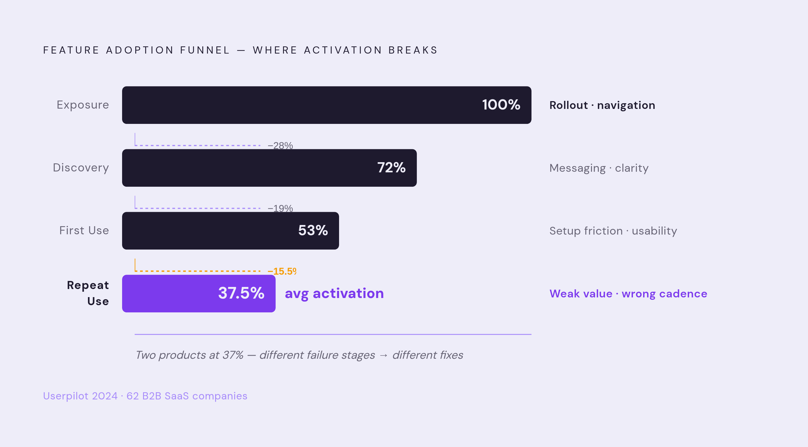
Four stages, four questions, and the stage where a cohort drops tells you exactly what needs fixing.
Exposure: did users even encounter the feature? If exposure is low, the problem is rollout, targeting, or where the feature sits in the navigation. Discovery: did users understand what it does and why it applies to them? Strong exposure paired with weak discovery points to a messaging problem, not a product problem. First use: did users attempt the activation event and finish it? Strong discovery with weak first-use numbers usually means setup friction or a usability snag. Repeat use: did users come back? Strong first use with weak repeat use raises a harder question: is the recurring value actually there, or was the cadence target wrong for this feature to begin with?
Low exposure gets misdiagnosed constantly. Throwing a product tour at a placement problem doesn't fix anything, it just adds a step in front of a feature users still can't find.
Userpilot's 2024 data, drawn from 62 B2B SaaS companies, puts average activation at 37.5%. That average hides everything interesting. Two products being at the exact same 37% activation rate can be failing at completely different stages, one losing people at discovery, the other losing them at first use, and the fix for each is nothing alike.
Countly's 2026 material cites Mixpanel research finding that products with clearly defined activation metrics see conversion rates from trial to paid up to 3 times higher than products tracking only generic engagement. The discipline of naming the stages, on its own, is most of the leverage.
One more layer before drawing conclusions: segment by customer size, industry, and onboarding model before diagnosing anything. The stage that trips up a self-serve SMB user often has nothing to do with the stage that trips up an enterprise account working through a dedicated onboarding call.
Behavioral signals versus time-based triggers as the basis for guidance
The broadcast model sends a "have you tried this?" email to everyone on day 7, no matter what they've actually done. That approach flattens three completely different user situations, never saw the feature, tried it and stalled, already adopted it, into one message. It's not really guidance. It's a mail merge.
Behavioral triggers work differently. A message fires because a specific action, or a specific absence of action, signals that a user needs something right now, not because a calendar date rolled around.
A few signals should guide the resulting guidance:
- A user finished the prerequisite workflow but hasn't navigated to the feature yet, a readiness signal.
- A user opened the feature but didn't complete the activation event, a friction signal.
- A user activated once but hasn't returned within the expected cadence, a lapse signal.
- A user's account configuration, plan, or role suggests this feature should be central to their workflow, a relevance signal.
None of these work off database state alone or event history alone. They work because the two are connected: what a user's account looks like, combined with what that specific user has and hasn't done. Role-based interfaces, account-level nudges, and context-aware support all depend directly on that connection between the two data sources. A user who just finished their first core workflow deserves a different message than one who hasn't even connected their data yet, and the message should reflect the specific thing they did or didn't do, not a generic segment label slapped on in a spreadsheet.
Mixpanel's 2026 material notes that AI-powered analytics can now infer intent from complex sequences of actions rather than static attributes alone, which pushes behavioral guidance from a nice-to-have into something closer to required infrastructure for any team running a product-led growth motion.
Skipping a message when the evidence is weak matters just as much as sending one when the evidence is strong. A nudge with no behavioral basis behind it isn't neutral, it's noise, and it quietly trains users to ignore the next message too.
The AI contamination problem: what happens to adoption metrics when agents use the product
AI agents are starting to operate inside B2B SaaS products on a user's behalf, and that creates a measurement problem most analytics setups aren't built to catch: the event stream records agent activity right alongside human activity, with no built-in way to tell them apart.
The distortion cuts in two opposite directions at once. An account where an agent is running through workflows automatically will show up as "highly active" by raw event count, even though the actual human behind that account may never have opened the feature themselves. Meanwhile, an account where an agent quietly handles routine tasks in the background will look like a low-engagement account by session length and click depth, when the customer might be extracting more value from the product than ever before.
Both readings are wrong, and both point the same direction: a click, an event, a session length was never a perfect proxy for value, it was always a proxy for activity. Agents just make the gap between the two impossible to ignore any longer.