Reporting Adoption Metrics Without Overstating Causal Lift
Adoption metrics need proper definitions to measure value, not just activity.

Feature adoption metrics tell a team what changed inside their product. They don't tell anyone why it changed, and that gap is where most SaaS reporting quietly falls apart. A dashboard can show green checkmarks across onboarding, engagement, and feature usage while trial-to-paid conversion sits flat for two straight quarters. The failure isn't in the metrics themselves. It's in treating activity as if it were proof of value.
What the denominator is counting, and why it determines everything
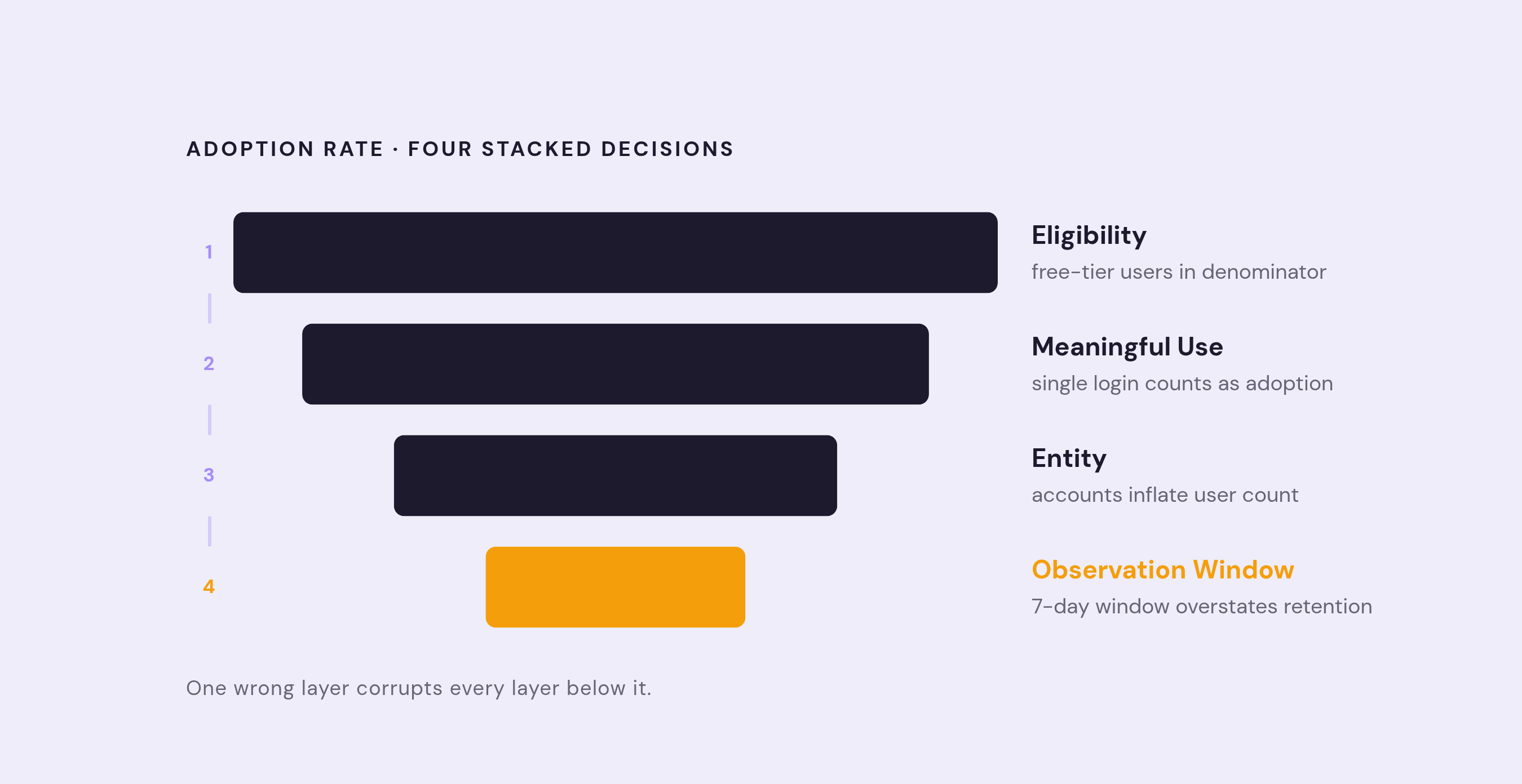
Every adoption rate looks like a single number. It's actually four separate decisions stacked on top of each other, and if any one of them is wrong, the number that comes out the other end is meaningless no matter how confidently it gets presented in a board deck.
The first decision is eligibility: who could have adopted the feature in the first place? The second is the meaningful-use rule: what actually counts as adoption, versus just touching the feature once? The third is entity: is the metric counting users, or accounts, because those answer different questions entirely. The fourth is the observation window: how long does someone have to act before they're counted as a non-adopter?
Get eligibility wrong and the damage compounds immediately. A common version of this mistake is counting every user who logged in during the period, regardless of plan tier or role or whether they even have access to the feature being measured. Free-tier users sitting inside the denominator for a paid-only feature will drag the adoption rate down artificially, making a healthy feature look weak. Only users with genuine access belong in that denominator. Segment before calculating, not after.
Entity confusion causes a subtler problem, especially in B2B. User-level adoption and account-level adoption are not the same metric wearing different clothes. An account can show healthy individual engagement while its overall activation profile signals real churn risk, because one power user logging in daily can mask multiple teammates who never opened the product. Multi-user activation is the number that actually predicts account health in a lot of B2B contexts, and it gets buried when everything rolls up to a single user-level figure.
Persona confusion compounds this further. An admin's value moment looks nothing like an end user's. An admin might configure SSO and invite ten teammates; an end user's version of success is finishing a first collaborative workflow with a colleague. Measure both groups against the same generic "adoption event" and the aggregate number describes neither of them well. This is part of why adoption rates vary so widely by product category and motion: benchmark data on activation rates shows FinTech and insurance products can be in the single digits, and product-led companies show noticeably different averages than sales-led ones. Two different problems, requiring two different fixes, not one dashboard.
The observation window closes out the list, and it's not a minor detail. "Adopted" within 7 days, 30 days, or 90 days are three distinct metrics, not three ways of saying the same thing. Every adoption figure that gets reported should carry a definition bar in front of it: entity, eligibility rule, meaningful-use rule, window, cadence, and how fresh the underlying data is. Skip that bar, and nobody reading the headline number actually knows what it measures.
The difference between a use event and meaningful adoption
Activation rate, properly defined, is the percentage of eligible users who complete the action that represents the feature's intended value, not just the percentage who clicked into it. That distinction between access and value realization is where most adoption reporting quietly loses its integrity.
Onboarding checklists are the clearest example. Median checklist completion across a broad sample of B2B SaaS companies remains low, and even that modest figure overstates what's actually happening, because checklist completion measures steps finished, not value reached. A project management tool can show a large share of new users finishing every onboarding step without a single one of them creating a project, assigning a task, or inviting a teammate to collaborate. The checklist measured output. It never touched value.
Compare two ways of defining engagement with the same collaboration feature. One product manager counts anyone who clicked "share" as having engaged, and reports a comfortably high percentage. Another defines adoption as a user sharing a document and a teammate actually editing it within 48 hours, a bar that far fewer users clear, sometimes below a third. But the users who clear that stricter bar convert at dramatically higher rates than the ones counted under the looser definition. The stricter number is smaller and less flattering. It's also the one that's actually telling the truth.
Repeat use is the signal that separates a real adoption event from a one-time trial. Features that get used again within the first week show retention rates several times higher at the 90-day mark compared to features where repeat engagement lags, according to behavioral analytics research on usage patterns. A single click is not adoption. A second visit, on the user's own initiative, starts to look like one.
The five-stage funnel breaks into exposure, discovery, first use, repeat use, and retained use. Each gap between stages points to a different failure, and treating them as interchangeable is where most product teams waste their fix. Low exposure means a rollout or placement problem. Strong exposure paired with weak discovery is a messaging problem, users see the feature but don't grasp why it matters to them. Strong discovery with weak first use points to friction in setup or usability. Strong first use with weak repeat use raises a harder question, about whether the feature solves a recurring need at all.
A metric labeled "adoption" that's really counting first clicks and a metric labeled "adoption" that's counting retained repeat use are not the same thing, even when they sit side by side on the same dashboard with the same name. Teams that mix these up end up defending real budget decisions with the wrong number.
Where the average feature adoption rate sits, and what the spread means
Benchmark data across a large sample of SaaS companies puts average core feature adoption around the mid-20s as a percentage, with the median running notably lower, in the mid-teens. That gap between average and median is itself informative: it signals a long tail, where a small number of standout performers pull the average well above what a typical company actually achieves. Anyone benchmarking against "the average" without checking the median is comparing themselves to a number a majority of companies never hit.
Industry spread compounds the problem. HR software tends to be at the high end of adoption benchmarks, AI and ML products land close behind, and FinTech and insurance trail well below both. The range is wide enough that cross-industry comparison is nearly worthless unless the comparison controls for product category first.
Go-to-market motion adds a second axis. Sales-led companies show slightly higher average adoption than product-led ones, a gap that's easy to misread as a verdict on strategy. It's more likely a selection effect: enterprise buyers under annual contracts have more built-in motivation to activate a feature than someone testing a self-serve trial for free. Company size adds a third variable, with mid-market companies (roughly $5 to $10 million in annual revenue) outperforming both smaller and larger peers, for reasons that differ at each end: smaller companies lack the resources to drive adoption deliberately, and enterprises run into adoption complexity across large, fragmented user bases.
Activation rate benchmarks show an even wider spread, with a broad multi-company sample reaching a median in the high 30s as a percentage, while top performers reach into the 60s and the weakest industries are in the single digits. Median, not average, is the more honest benchmark here, given how skewed the distribution runs.
None of these numbers should be used to declare victory or failure on their own. A team that simply tightens its eligibility definition, narrowing the denominator to only genuinely eligible users, can watch its adoption rate drop by ten percentage points overnight without any actual change in product behavior. That's not decline. That's honesty appearing in the math at last. Comparing a well-defined metric against its own trend over time, month over month, tells a team more than beating an industry average built on a looser definition ever will.
Why observed post-intervention adoption is not the same as proven causal lift
Adoption climbs after a campaign goes out, and someone on the team reports that the campaign drove the increase. That phrasing is almost never justified, and the reason comes down to who responds to a nudge in the first place.
Users who act on a tooltip, an in-app message, or a feature announcement are not a random slice of the eligible population. They are systematically different from users who ignore the same message, often because they were already closer to adopting the feature on their own. Recent analysis of AI feature adoption in SaaS products has pointed directly at this problem: measured lift often reflects selection, not causation, because the gating variable determining who even sees the feature (seats, license tier, plan level) is already correlated with who was going to adopt regardless.
The retention correlation trap runs on the same logic. Accounts that adopt more features tend to retain longer, and it's tempting to conclude the features caused the retention. The more defensible reading is that both outcomes come from the same underlying trait: these accounts were already healthier, already more engaged, already more likely to stick around. Benchmark data on this point is stark. Accounts using five or more features retain at rates far above accounts using only one or two, according to churn-focused benchmark research. That's a real and useful signal. It is not proof that pushing more feature adoption onto a struggling account would raise its retention.
This is the exact distinction between attribution and incrementality. Attribution assigns credit to whichever touchpoint a user interacted with before converting. Incrementality asks a harder, better question: how much did that touchpoint actually change the outcome, compared to what would have happened anyway? Industry survey data from 2025 shows a majority of brand and agency marketers in one country now running incrementality testing specifically because attribution alone kept overstating impact, and a meaningful share plan to invest further in it... brand and agency marketers now running incrementality testing specifically because attribution alone kept overstating impact, and a meaningful share plan to invest further in it.
Every adoption team should be asking the same question before writing up a result: did the guidance cause the user to adopt, or were they already on that path? The language used to report the answer matters as much as the analysis itself. "Associated with higher retention" and "caused higher retention" describe two different levels of evidence, and swapping them in a report, even casually, misleads whoever reads it next.
The closest thing to causal evidence most teams can practically build
Full experimental proof isn't always available, but there's a middle ground between guessing and running a formal trial, and most teams underuse it.
Cohort retention curve comparison is the most accessible version. Plot the retention curve of users who adopted a feature against the curve of users who didn't. If the adopter cohort holds a materially higher retention line over time, that's real quantitative evidence the feature is tied to business value. If the two curves sit nearly on top of each other, the feature is probably a nice-to-have rather than a retention driver. This method cannot prove the feature caused the retention gap rather than simply attracting users who were already more engaged to begin with. Report the curve. Report the limitation next to it.
Controlled experimentation, with randomized assignment between an intervention group and a control group, remains the only approach that establishes causal lift with real confidence. Domain expertise and statistical controls can narrow the uncertainty around an observational result, but they don't substitute for randomization when the goal is a causal claim.
Short of a full experiment, eligible-cohort framing is the most practical discipline available. Measuring adoption only within the group that genuinely had the opportunity to receive guidance narrows the selection effect considerably and makes a post-intervention number far more interpretable, even without a formal control group sitting alongside it.
A useful real-world illustration of this discipline comes from how Slack identified a specific message-volume threshold, around 2,000 messages sent within a team, that correlated strongly with long-term retention. That threshold came out of product event data, not out of email open rates or click counts, and it was used as a targeting signal to decide who to nudge toward deeper adoption. It was never treated as proof that the nudge itself caused the retention. That distinction, between a signal worth acting on and a causal claim worth publishing, is the whole discipline in miniature.
When only observational data exists, the honest report includes three things: the adoption rate within the eligible cohort, the retention curve comparison against non-adopters, and an explicit statement of how confident that inference actually is. What it should never include is a line claiming a campaign "drove" a specific lift percentage when no control group ever existed to prove it.
Reading the stage funnel to diagnose before intervening
Low adoption should never jump straight to "we need a better product tour." The stage where users actually drop off should decide what happens next, and skipping that diagnosis is how teams end up shipping fixes for problems they never confirmed.
Low exposure points to a rollout or placement issue, not a messaging one; the fix is getting the feature in front of more eligible users, not rewriting the copy. Strong exposure paired with weak discovery flips that logic: users saw the feature and moved past it anyway, which usually means they don't understand why it applies to their specific workflow. Strong discovery paired with weak first use points somewhere else entirely, toward setup friction or a usability wall, and sending more announcements into that gap just funnels more users into the same failure point. Strong first use with weak repeat use raises the hardest question of the four: does this feature solve a recurring problem, or did it only ever solve a one-time need?
One version of this gap looks deceptively fine on the surface: low adoption depth paired with high satisfaction among the users who did find the feature. That's not a value problem at all. It's a discovery problem wearing a value problem's clothes, and the fix is getting more eligible users to the feature, not changing the feature itself.
Contextual triggers, surfacing a feature based on what a user is actually doing in the moment rather than parking it in a static menu, tend to lift discovery meaningfully compared to menu-based placement. But that trigger only works as a response to a diagnosed discovery gap. Deployed as a general-purpose adoption booster without that diagnosis first, it's a solution looking for a problem, and it usually finds the wrong one.
Funnel reading has to be a routine habit, not something that only happens after a bad quarter. A renewal lost in the fourth quarter was very often visible as a churn signal back in the first quarter, sitting quietly in adoption data that nobody was reading at the time.
How to construct an adoption report that does not overstate what the data shows
Every adoption number needs a definition bar sitting above it before anyone is allowed to interpret it: entity counted, eligibility rule, meaningful-use definition, observation window, reporting cadence, data freshness, and a version number for the metric itself. Skip that bar, and the headline figure can't be compared to last month's, let alone to a competitor's.
The headline row of a serious adoption report isn't one number. It's five: active-eligible user adoption rate, account-level adoption rate reported separately, repeat adoption rate, retained adoption rate, and median time-to-adopt. Collapsing these into a single figure is exactly how a healthy-looking dashboard hides an unhealthy account base.
The stage funnel belongs in the report with raw counts sitting next to the percentages, not instead of them. A 50% drop from ten thousand users to five thousand is a very different problem than a 50% drop from ten users to five, and a percentage-only funnel erases that difference entirely.
Cohort views matter too: retained feature use, tracked by the cohort's first-meaningful-use date, at whatever cadence fits the product's natural usage rhythm. That view is the closest thing available to a durability check on adoption, showing whether use sticks or fades.
Language discipline has to run through the whole document. "X% of eligible users adopted within 30 days" describes observed behavior. "The campaign caused X% adoption" is a causal claim that requires experimental evidence to back it up, and the two sentences should never appear as if they mean the same thing. The report should state what it does not claim: that post-message adoption proves causal lift, that an adoption rate without an eligibility filter measures anything real, or that a rising number automatically means the right users are the ones adopting.
Persona and account splits deserve the same treatment. An enterprise segment's activation rate being in the mid-50s as a percentage while a self-serve segment is in the single digits is not a single story with two footnotes. It's two separate product and go-to-market problems, and combining them into one blended number hides both.
The highest-performing SaaS companies already treat post-sale metrics, activation rate, feature adoption, net revenue retention, expansion revenue, with the same rigor they'd apply to pipeline coverage or win rate in a sales forecast. That's the standard adoption reporting should be held to, not a lower one just because the data sits downstream of the sale.
Moving from description to prescription, what the data should produce
Analytics runs across four modes: descriptive, which answers what happened; diagnostic, which answers why; predictive, which answers what's likely to happen next; and prescriptive, which answers what to actually do about it. Most adoption dashboards never get past the first mode. They show a chart. The chart moves. Nobody connects that movement to a decision.
Getting to diagnostic requires the stage funnel discipline already covered, tracing a drop to its actual point of failure instead of guessing. Getting to predictive means using the retention curve comparisons and cohort data to flag which accounts or user segments are heading toward disengagement before the decline becomes visible in a churn report. Getting to prescriptive means the report ends with a specific action tied to a specific stage failure, a change to onboarding sequencing, a shift in where a feature gets surfaced, a targeted outreach to accounts stuck below a usage threshold, not a general call to "improve adoption."
A dashboard that stops at descriptive can still be honest. It just can't be useful on its own. The teams that get real value out of adoption data are the ones willing to draw a straight line from a well-defined number, through a diagnosed cause, to a specific decision, and willing to state clearly when that line runs out and a guess has to take over instead.