Separating Vanity Engagement Metrics From Adoption Behavior Metrics
Adoption metrics reveal whether users found value; vanity metrics just show they showed up.

A team celebrates rising logins, growing session counts, and strong click-through on a new feature. Meanwhile, a renewal cohort quietly churns, sitting in the same dashboard, telling a different story nobody read. Neither signal was wrong on its own terms. Session counts went up, and click-through was strong. The mistake was treating both as evidence of adoption when only one of them actually measures whether a user reached value.
That's the structural gap this piece draws a hard line around. Vanity metrics describe what happened. Actionable metrics predict whether it mattered. One counts motion, the other counts outcome, and mixing them up is how a good-looking dashboard sits next to a shrinking renewal cohort without anyone noticing until the quarter's already lost. This is written for product and growth teams at B2B SaaS companies staring at a wall of metrics who still can't answer the one question that matters: are users actually adopting this thing, or just touching it?
What makes a metric vanity: the structural test
A vanity metric is a number whose direction tells you nothing about whether the user got value out of the product. It's a number whose direction tells you nothing about whether the user got value out of the product. That's the test, and it's a simple one to run: does this metric move differently depending on whether someone reached value, versus if they never did? If the honest answer is "not necessarily," the metric is vanity in that context, no matter how good it looks on a slide.
Total clicks, page views, cumulative session counts: all of these pass the vanity test in the wrong direction. They trend up as an account adds headcount, completely independent of whether adoption is improving. Login frequency is the classic false positive. A user can log in every day, click through the entire onboarding checklist, and still churn at 30 days because none of that activity was the behavior that actually generates value for them.
Raw signup counts have the same problem. Ten thousand signups sounds like a bigger win than three thousand, until you check what happened after. A product with 10,000 signups and a 15% activation rate is in worse shape than one with 3,000 signups and a 60% activation rate. The second product is winning, even though it looks smaller on paper. That's not a rounding error, it's the whole story, and it only becomes visible once you stop counting signups and start counting who actually did something with them.
None of this means teams are measuring the wrong things. The problem is narrower and more common than that: they're using descriptive numbers to answer predictive questions, and descriptive numbers were never built for that job.
What makes a metric behavioral: value realization as the threshold
Behavioral adoption metrics aren't just a more detailed flavor of engagement metrics. They measure whether a user crossed a specific threshold, one that the data reveals as correlated with retention. That threshold is the whole point.
Under that umbrella sit a handful of related signals: activation events (did the user do the thing that predicts they'll stick around?), feature usage patterns tied to core value rather than surface clicks, time-to-value measures, and later-stage retention or expansion signals. A user who clicks "Create Report" has generated a data point. A user who generates the report, downloads it, and shares it with a teammate has done something else entirely, something closer to what the product is actually for. That's the line between usage and adoption, and it's not subtle once you're looking for it.
Adoption happens when someone crosses a milestone that the data shows predicts retention, not when they finish an onboarding tour or show up in the login logs three days running. Vanity metrics describe what a user did. Actionable metrics tell you whether what they did was worth anything. That distinction is the whole argument of this piece, and everything from here on is about how to find and validate those thresholds in practice.
Activation rate: the first behavioral threshold and why it is not onboarding completion
Activation rate is the percentage of new users who complete the specific action that predicts they'll still be around months later. Not "verified their email." Not "clicked through the checklist." The one behavioral moment, specific to that product, that the data shows actually matters.
The formula is straightforward: users who hit the activation milestone within a given window, divided by total new users in that cohort, times 100. The milestone itself has to be grounded in the product's real value. For a messaging tool, that might be sending a first message to an actual contact. For a reporting tool, it's generating and viewing a first real report, not opening the report builder and staring at it.
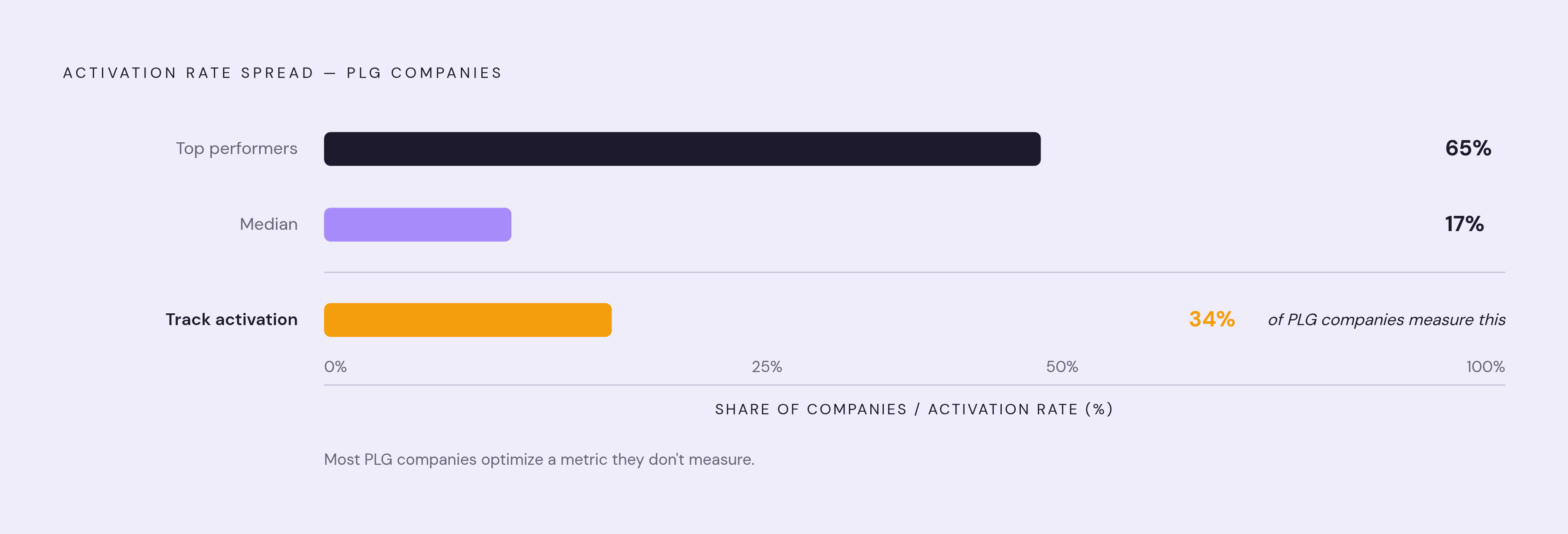
The spread across the industry is wide enough to be alarming. Median SaaS activation rate is around 17%. Top performers get to 65%. In a typical product-led growth funnel, something like 40 to 60% of free users never reach the activation milestone. These users signed up, poked around, and vanished without ever touching the thing that would've made the product useful to them.
Only about 34% of PLG companies actually track activation as a metric. That gap, between companies betting their growth motion on PLG and companies actually measuring the one number that tells them if it's working, is where a lot of programs quietly leak value for months before anyone catches it.
The growth math makes the case on its own. Moving activation rate from 20% to 30% produces roughly the same top-line effect as a 50% jump in signup volume, at a fraction of the cost, because you're not paying acquisition costs on users who were already in the funnel. And none of this is the same as onboarding completion. A user can check every box on the checklist and still be gone in 30 days, because the checklist was never the behavior generating value.
Time to first value: how speed of reaching the behavioral threshold predicts retention
Time to first value (TTFV) measures the gap between signup and the first behavioral outcome that actually means something, not "finished setup," not "logged in twice." Speed here is predictive. It's predictive.
Target ranges differ by product type. Self-serve SMB products should aim for under seven days, ideally inside the first session. Mid-market products that need real configuration work tend to be in the 14 to 21 day range and still be considered healthy. What's consistent across both: every 10% reduction in time to value tracks with roughly an 8% lift in 90-day retention for that same cohort. Speed compounds.
AI-native products are pushing this further, with leading products redefining time-to-value down to under 60 seconds. Slower onboarding flows are going to lose ground to products that hand the user a result almost immediately, and that pressure isn't going away.
TTFV is useful as more than a score, though. It's a diagnostic. If a product runs a 7-day trial but the actual time-to-value is 14 days, there's a structural mismatch: the trial ends before the user has any reason to convert. A team watching session counts in week one has no way to catch that. A team watching time to first meaningful behavioral event catches it immediately, because the number is telling them the trial window doesn't match the product's own pace.
Feature adoption rate: why the denominator you choose changes what the number means
Feature adoption rate looks like one number. It's actually four decisions stacked on top of each other: who was even eligible to adopt the feature, what counts as adoption (a completed workflow, not a stray click), whether you're counting at the user level or the account level, and over what time window.
The formula itself is simple once those decisions are made: distinct eligible users or accounts that reach meaningful use, divided by distinct eligible users or accounts in that same window, times 100. Teams get tripped up by the eligible population. Using total registered users in the denominator, instead of the users who could actually access the feature, is how a real behavioral metric quietly turns back into vanity. It understates adoption every time for anything gated by plan tier, role, or permission, and it does so silently.
The usage-versus-adoption distinction is visible here too. Clicking "Create Report" is usage. Generating it, downloading it, and sharing it with a team is adoption. Typical B2B SaaS feature adoption rates are somewhere between 20 and 40%, with newly launched features often at 20 to 30% adoption in their first month, and high performers reaching 40 to 50% for features tied to core workflows. Broader analysis of feature usage across SaaS products has found that around 80% of features see low to no regular usage at all, with only the strategic, core-workflow features climbing into the 40 to 65% range.
There's no single benchmark that applies across all feature types, and pretending there is one just muddies the read. A mature core workflow, a new beta feature, an admin setting, and an annual export report aren't playing the same game, so they shouldn't share a target. And no benchmark means anything without the eligible-cohort denominator that defines it. A 15% adoption rate measured against all registered users and a 15% rate measured against eligible active users are two completely different signals wearing the same number.
DAU/MAU stickiness and account-level adoption: the two measures vanity metrics most commonly replace
DAU/MAU stickiness is the ratio of daily active users to monthly active users. It's meant to answer a simple question: do people come back out of habit, or only once in a while? A lot of teams have been benchmarking against a 40% stickiness figure that's outdated. A 2026 Mixpanel analysis covering more than 12,000 companies puts the real B2B SaaS average closer to 31%. Plenty of teams have been grading themselves against a number that never applied to their category.
Above roughly 20% suggests habitual use, above 50% suggests the product has become a daily utility people build their work around. Below that, usage is closer to occasional.
MAU on its own is one of the cleanest examples of a metric that looks behavioral but isn't. It counts presence in the product, not whether meaningful work got done inside it. For B2B products specifically, the more honest measure is account-level adoption: accounts with two or more active users completing core workflows, divided by total accounts, times 100. Individual adoption doesn't predict renewal on its own, because if the product never spreads past one person on the account, it never became infrastructure. It stayed a personal tool that one champion happened to like.
That difference appears in renewal numbers. Accounts with multiple active users renew at two to three times the rate of single-user accounts, because the product has become something the team depends on rather than something one person uses quietly. The B2B failure mode to watch for: an account with one power user showing great individual DAU/MAU, celebrated internally, while renewal risk sits high the entire time because the product never went wide across the team.
Segmentation matters just as much here. Blending enterprise accounts and self-serve accounts into one stickiness number will mislead almost every time. Mid-sized businesses, in the $5 to $10 million annual revenue range, show up in benchmark data with the strongest adoption rates, around 30.4%, which only becomes visible once that segment is pulled out of the aggregate.
Validating that a behavioral milestone predicts retention, not just correlates with activity
Picking a milestone because it feels behavioral isn't enough. It has to earn that status with data. The method: define the milestone (completed first workflow, invited a teammate, exported data), split users into two cohorts, those who reached it within a defined early window and those who didn't, then track what percentage of each group is still active at 30, 60, and 90 days.
The read is blunt by design. If Cohort A retains at a substantially higher rate than Cohort B, that gap proves the milestone actually predicts retention. If the gap is negligible, the milestone is decorative, and it shouldn't be anchoring anyone's activation definition. This cohort lift test is the only honest way to tell a real adoption metric apart from an activity metric dressed up to sound behavioral.
Timing backs this up from a different angle. Analysis of product usage data has found that users who engage with new features within their first week show retention several times higher at the six-month mark than users who delay past 30 days. A separate look at behavioral analytics found that features achieving repeated use within the first seven days see substantially higher 90-day retention compared to features where repeat engagement lags. Speed and repetition, together, are doing a lot of the predictive work.
High activation numbers on their own prove nothing if those same activated users churn a month later. That's what the cohort test is built to catch. A related diagnostic to run alongside it is workflow completion rate, meaning users who finish an entire workflow divided by users who started it. A low completion rate means most users who begin a core job never finish it, usually because of friction at a handoff point or a next step that was never made clear. None of these numbers are fixed forever, either. Whenever cohort analysis shows a milestone's predictive power has faded, the metric stack needs revisiting, not defending.
How feature adoption depth connects to net revenue retention, not just product health
Feature adoption is one of the strongest leading indicators of net revenue retention that a SaaS company has access to, more reliable than satisfaction scores, support ticket volume, or how warm the relationship wit... It's one of the strongest leading indicators of net revenue retention that a SaaS company has access to, more reliable than satisfaction scores, support ticket volume, or how warm the relationship with the executive sponsor feels on a call.
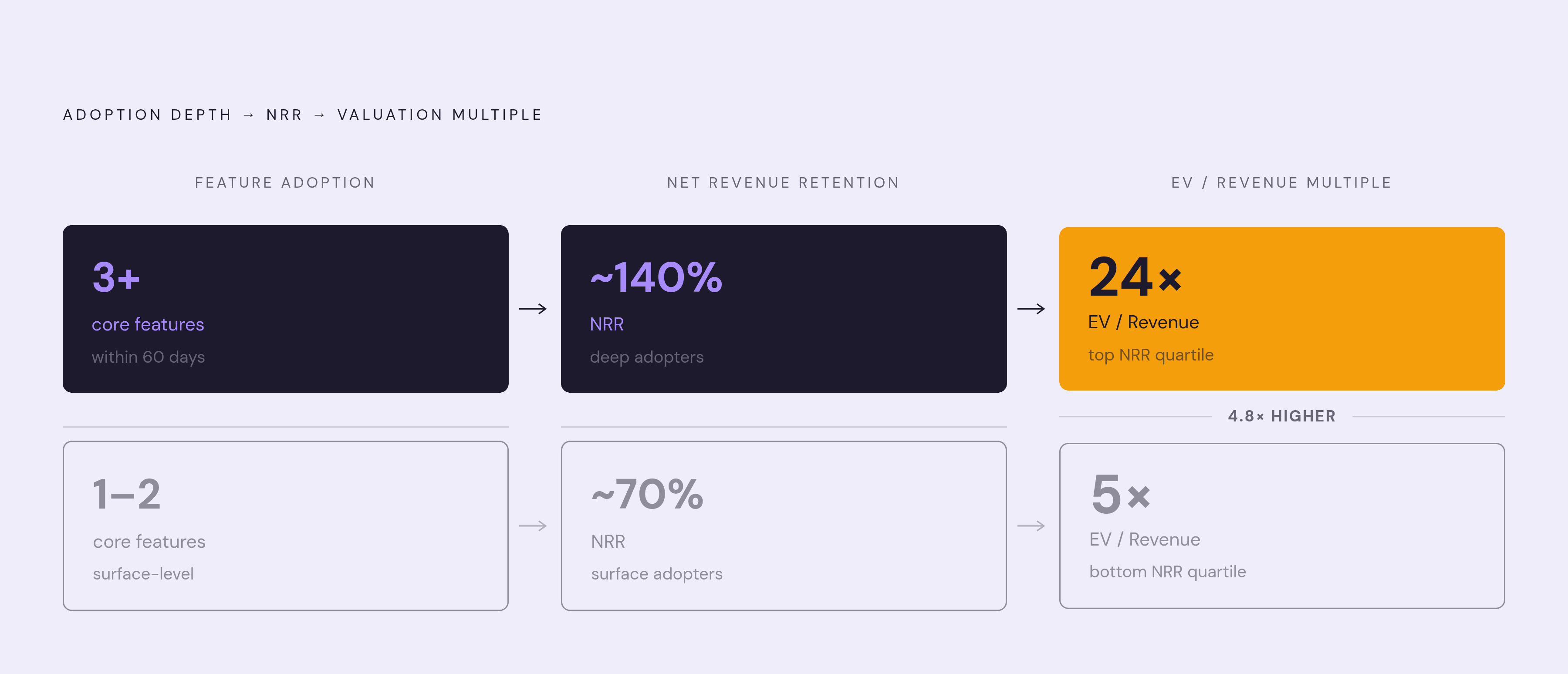
Customers who adopt three or more core features within their first 60 days show net revenue retention roughly double that of customers who stay stuck in surface-level usage. And the financial stakes attached to that gap are large: research cited from McKinsey shows companies in the top NRR quartile trading at 24 times EV/Revenue, against 5 times for the bottom quartile. That's not a rounding difference in a board deck, that's a different category of company in the eyes of the market.
The mechanism is fairly intuitive once it's named. A product woven into daily workflows doesn't just get renewed, it gets expanded, referred to other teams, and defended against competitor pitches, because ripping it out would mean rebuilding a workflow from scratch. Adoption depth is what actually creates switching cost, not the contract terms.
Which means: if a team's adoption metrics never connect back to renewal or expansion, they're still operating in descriptive mode, even if they swapped out login counts for feature-click events. Same problem, better disguise. Vanity engagement metrics can never reveal this signal at all, because they describe activity, and activity by itself does not cause revenue retention to move in either direction.
The measurement mistakes that turn behavioral metrics back into vanity metrics
Even a well-chosen behavioral metric can slide back into vanity territory, and it usually happens through one of a few specific mistakes.
Blending segments is the first. A single adoption number averaged across enterprise and self-serve, or across customer bases with genuinely different use cases, will mislead almost every time. Segment first, draw conclusions second, never the other way around.
Wrong denominators come next. Swapping in total registered users where eligible users belong converts a perfectly good behavioral metric into a vanity number without anyone changing the metric's name. The number keeps its label. Its meaning changes underneath it.
And measuring a milestone without ever validating that it predicts retention is the mistake that undoes everything else. A milestone chosen because it felt significant, rather than one confirmed through a cohort lift test, is a guess wearing the outfit of a metric. It'll sit in the dashboard looking exactly like the real thing, right up until a renewal cohort proves it wasn't.