Defining Activation Events That Predict Long-Term Retention in B2B SaaS
Finding specific product behaviors that predict retention beats onboarding checklists.

Activation events that actually predict retention in B2B SaaS are not onboarding milestones. They are specific, thresholded behaviors, tied to a time window, that correlate with a customer's continued use of the product months later, and finding them requires connecting product behavior data to retention outcomes rather than guessing at what "getting started" should look like.
Most teams conflate the two. Onboarding completion, tour-finished events, and profile setup are compliance metrics: they tell you whether someone clicked through a checklist, not whether the product delivered anything to them. Connecting an integration is a setup step. Getting value from that integration, running the first report, seeing the first automated result, is the actual event. The distinction sounds small until the data shows how much damage it does.
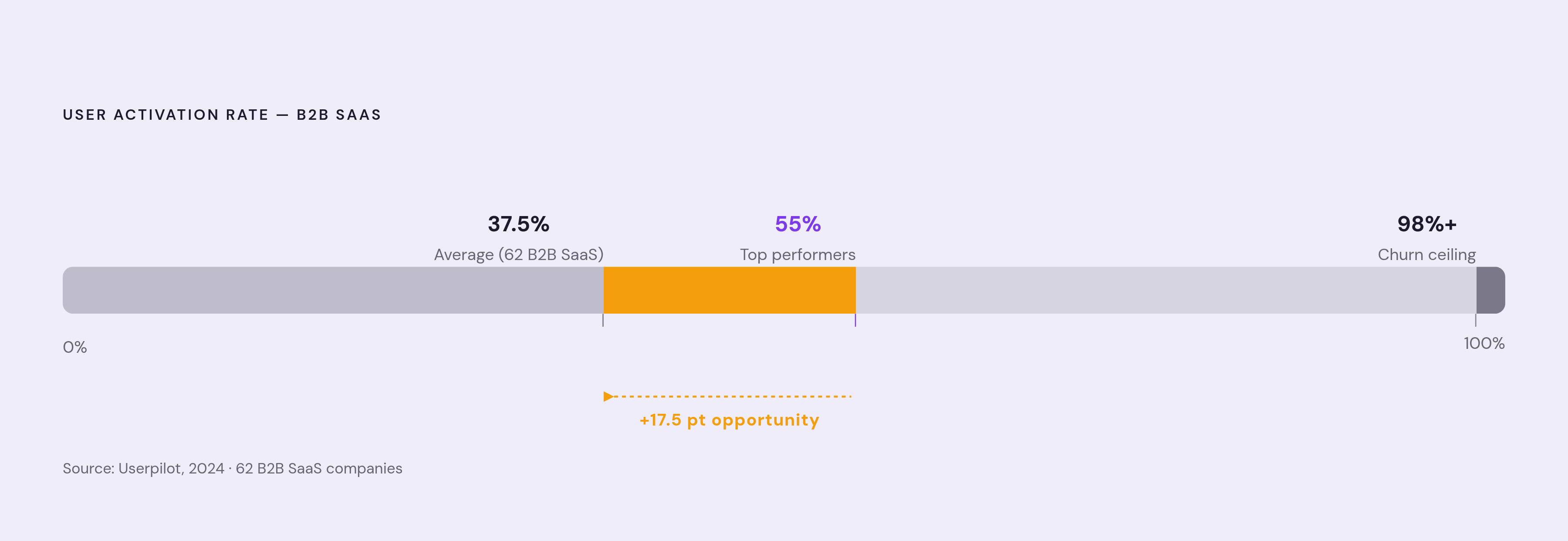
Amplitude's 2025 benchmark data, drawn from more than 2,600 companies, found that over 98% of new users churn within two weeks when they never hit a real value milestone, even as onboarding dashboards show completion rates ticking upward the whole time. RevenueCat documented a subscription app that hit over 90% onboarding completion on both iOS and Android, yet most of those same users had churned by day two. Procedural completion and value delivery are not the same curve, and one does not predict the other. Available benchmarks show that generic product tours complete at a median of roughly 15% and do not reliably predict conversion.
The result, across 62 B2B SaaS companies, is an average user activation rate of 37.5%. Two-thirds of signups never experience the core value proposition of the product they signed up for. The fix is a properly chosen activation event, not a longer onboarding flow or a friendlier tour. It's choosing the right event to measure, and proving, with data, that it actually predicts retention.
What makes an activation event valid, not just convenient
A real activation event has to pass three tests, a framing RevenueCat has used in its own research. Users who hit the event must retain meaningfully better than users who don't. That relationship has to hold across segments, not just in the aggregate. And improving the event, getting more users to reach it, has to demonstrably move the outcomes it's supposed to influence: retention, conversion, renewal. If an event fails any of those three tests, it's a compliance metric wearing an activation costume.
It also helps to separate four ideas that get used interchangeably but mean different things. Time to First Value is the moment a user first perceives value, often subjective and hard to instrument precisely. Time to Core Value is the point where usage becomes a sustained pattern, the kind that predicts renewal rather than a one-off flicker of interest. Activation rate is simply the fraction of a cohort that reaches the validated event inside a defined window. And the "aha moment," the phrase teams reach for constantly, is a qualitative story that a well-defined activation event only approximates in numbers.
That time window matters more than it sounds like it should. "Created a project sometime" is not activation. "Created a project within three days of signup" is. Buildmvpfast.com's guide puts the typical window for B2B SaaS at 7 to 14 days, though the right window depends on the product's natural usage cycle. And the single-action framing can mislead teams entirely: sometimes the signal isn't whether someone did the action, it's whether they did it enough times. The threshold is part of the definition, not a detail to tack on later.
Slack's example has become close to canonical at this point. Stewart Butterfield identified 2,000 messages exchanged as the threshold where teams crossed into genuine, sustained value, a number that still shows up in nearly every write-up of activation metrics because it's so specific and so far from arbitrary. Slack's threshold-based activation approach is widely cited as a driver of its strong retention among paying customers. Facebook found something structurally similar years earlier: users who added seven friends within their first ten days were overwhelmingly likely to become long-term engaged users. Both examples share the same three-part anatomy, combining a specific behavior, a specific count, and a specific time window. Remove any one of the three and the metric stops meaning anything.
The empirical method for finding your own activation event
Finding this event is not a matter of intuition or executive preference. It's a data exercise, and it follows a fairly disciplined sequence.
Start by pulling every action tracked in the first seven days of a user's life in the product, and list all of it before narrowing anything. This is the step teams rush, usually because someone on the team already has a favorite candidate event in mind. Resist that. Get exhaustive first.
Then correlate each action against 30-day retention. Calculate the retention rate for users who performed the action against those who didn't, and look for the largest gap. Buildmvpfast.com offers a clean illustration of what this looks like in practice: if users who created a dashboard in their first week retain at 72%, while users who never created one retain at 18%, that 54-point gap is the signal worth chasing. Gaps that size don't happen by accident.
From there, test thresholds. "Created 3 reports" might predict retention meaningfully better than "created 1 report." Run different values of N against the retention data and look for the point where the curve bends, the tipping point where doing the thing a few more times separates the users who stick from the users who don't.
Once a threshold and a window are both validated, freeze the definition. Hold it stable for at least 12 months so cohort comparisons stay meaningful over time; changing the definition every quarter destroys the ability to compare one cohort against the next. Amplitude's own cross-temporal data backs up how strong this signal can get when it's built correctly, showing a 69% correlation between strong seven-day activation and strong three-month retention, a useful benchmark for how predictive a well-chosen event can actually be.
None of this works without instrumentation that goes beyond the event itself. Track every step leading up to the activation event too, so a funnel view can show exactly where users drop off before they ever get there. At minimum, each event needs a user ID, a timestamp, plan type, signup source, and team size attached to it. Several analytics platforms on the market today, open-source and commercial alike, support this kind of event tracking and cohort analysis; the method determines the value of the analysis, not the specific tool chosen to run it.
Account-Level and Team-Level B2B Activation
B2C activation is usually a single-user event. Someone signs up, does the thing, and either sticks around or doesn't. B2B breaks that model immediately, because one employee signing up and activating tells you almost nothing about whether the account as a whole is going to renew.
Buildmvpfast.com's churn research quotes a founder who identified the top reason for churn: "we couldn't get our team to use it." That's an adoption problem, and it's one that individual user metrics are structurally incapable of catching, because the metric that matters lives at the account level, not the seat level. The discovery, in that case, came from a fairly unglamorous method: reaching out directly to churned customers to understand why they left. The feedback informed changes to onboarding and account monitoring. Churn dropped 40% after the changes went in.
Three metrics matter more than individual-level activation once you're looking at accounts rather than users. Time-to-First-Value measured at the account level, not the individual. Team Activation Rate, meaning how many members of a given account have actually reached the activation event, not just one champion who signed the contract. And adoption depth of the core "aha moment" feature across the whole account, not just the admin who set it up.
These account-level signals predict churn and expansion far better than any user-level dashboard, because they capture the actual unit of risk in B2B: the account, not the seat. That also means the acceptable activation window shifts depending on how the product is sold. Self-serve and product-led products should target 40 to 60% activation within 7 days. Sales-assisted or hybrid motions should expect 50 to 70% within 14 days. Buildmvpfast.com's guide places enterprise and high-touch deployments on a longer clock: 60 to 80% activation within 30 days. Against all of that, the industry's top performers are near 55% activation, well above the 37.5% average across the broader Userpilot benchmark set.
Dashboards built around individual seats miss the point entirely for B2B. Activation signals that treat the account as the unit and the team as the actual subject of measurement are the ones that give a customer success or product team something they can act on.
Feature adoption depth and breadth as the layer beneath activation
Activation gets someone through the door once. What happens after that is a separate question, and it comes down to how much of the product an account actually leans on.
Shallow adoption is fragile. An account relying on one or two features can walk away without much friction at all; an account relying on five or six is far harder to dislodge, because leaving means rebuilding workflows across the business, not just canceling a subscription. It helps to think in tiers. Core features are the ones every user should touch, full stop. Power features are the differentiators, the reasons someone chose this product over a competitor, and if fewer than 20% of users have adopted them, that's either a discoverability failure or a genuine value problem to investigate directly. Advanced features serve narrower use cases and naturally see lower adoption; that's expected and not itself a warning sign.
The warning sign is elsewhere: buildmvpfast.com's research found that accounts with feature adoption below 30% show an 80% correlation with first-year churn. That's not a soft relationship. Both depth and breadth matter for predicting the customer's lifecycle: how deeply an account uses core features, and how many distinct features it touches in its first month.
The urgency here is compounding. Userpilot's State of SaaS research found that the average share of SaaS features actually used by customers has fallen to about 6%, down sharply from roughly 20% just a few years earlier. Engineering teams have shipped faster than users can absorb, and the playbooks that worked for driving feature adoption in 2022 don't hold up against that gap anymore.
Stickiness, measured as DAU over MAU, gives a useful cross-check. Ratios at or above 13% are associated with stronger activation performance; products that push meaningfully higher tend to signal that the product has become part of a user's regular routine rather than a tool they open occasionally. Activation gets someone to first value. Feature adoption, depth and breadth together, determines whether they stay long enough to expand.
Reading Retention Curve Shape as a Health Signal
Cohort analysis built around acquisition channel tells you where users came from. It doesn't tell you why they leave. Behavioral cohorts, grouping customers by an action they took in their first week or month, say, everyone who ran their first report within 7 days, give a far sharper diagnostic picture.
Measuring retention from the date of signup dilutes the curve with dead signups, accounts that never engaged in the first place, and the resulting data is close to unactionable. Measuring from the activation event itself strips that noise out and produces a curve teams can actually respond to.
The shape of that curve is the signal. A curve that flattens, that stops declining and holds at some level, indicates product-market fit for that particular cohort. A curve that keeps sliding downward without ever leveling off points to a deeper value problem, one that no amount of onboarding polish will fix. Amplitude's own research offers a rule of thumb here: when at least 7% of a new cohort returns on day 7, the product is in the top quartile of activation performance across the market. Fall below that, and the product is, statistically, in the bottom three-quarters of comparable companies.
Two retention matrices are worth building in parallel, because they answer different questions. Logo retention tracks the percentage of original accounts still active. MRR retention tracks the percentage of original revenue still active, plus whatever expansion has layered on top. An account base can hold steady on logos while quietly shrinking on revenue, or the reverse, and either story changes what a team should do next.
Expansion readiness appears in the same data. Accounts hitting usage limits, inviting new team members, or asking about features locked behind a higher tier are surfacing themselves as ready for a growth conversation, often before anyone on the customer success team notices. Research has linked a 25% boost in user activation to a 34% increase in monthly recurring revenue, and expansion ARR has grown substantially as a share of new ARR over recent years. Onboarding and adoption aren't a cost center anymore. They're the engine behind net revenue retention.
The churn signals that appear in product data before anyone notices
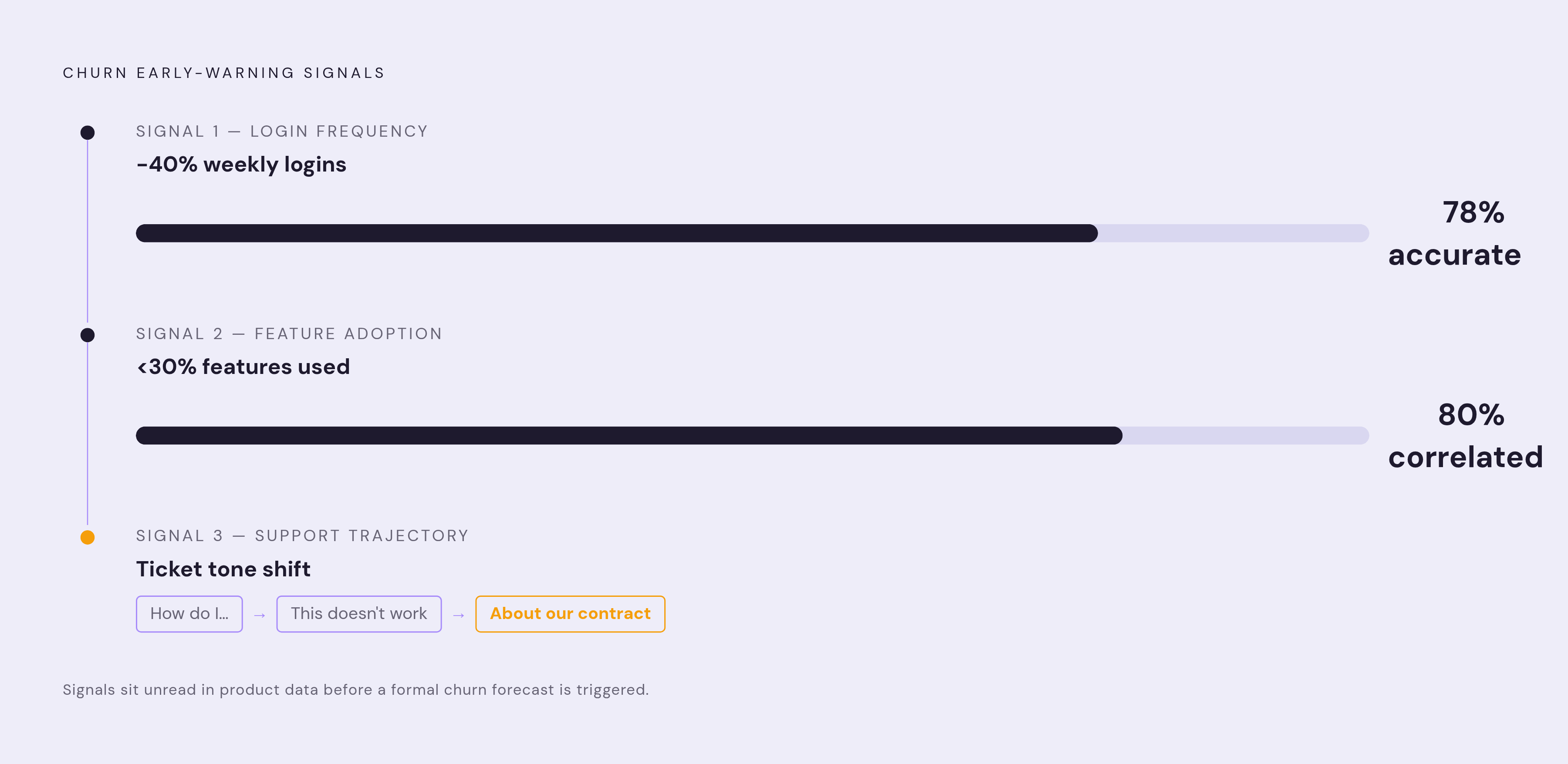
By the time a customer actually cancels, the decision was made weeks earlier, and the evidence was sitting in the product data the entire time.
Login frequency is the simplest of these signals to track. Imperva's churn prediction research found that a 40% drop in weekly logins predicts churn with 78% accuracy, though the trend matters far more than the absolute number: a heavy user who drops to moderate use is a different story than a light user staying light.
Feature adoption drop-off is the deeper signal. Comparing an account's feature use against the "success profile" built from the best-retained cohorts shows where a gap is forming. If top-performing accounts all touch a key feature by day 7, and a given account still hasn't touched it by day 14, that gap is an early warning worth acting on before renewal season, not during it.
Support tickets carry a signal too, though it's in the trajectory rather than the volume. Tickets that shift from "how do I do this" to "this doesn't work" to "we need to talk about our contract" are telling a story in three acts. A previously quiet account suddenly filing several tickets in one week is telling a shorter, blunter version of the same story.
The same mechanism runs in reverse for expansion. An account whose adoption curve tracks the historical pattern of past upgraders is a cue to start that conversation while the value is obvious to the customer, not on some arbitrary contract-renewal date months later.
The 2025 Recurly Churn Report puts average monthly churn for B2B SaaS at 3.5%, with top performers under 2%. Enterprise SaaS runs 0.5 to 1% monthly; SMB and self-serve segments run considerably hotter, at 3 to 7%. Research from Kyle Poyar and ChartMogul, published in December 2025 and drawn from roughly 3,500 software businesses, found that AI-native companies post a median gross revenue retention of just 40%, against 63% for traditional B2B SaaS in the same sample. Price point matters enormously within that group. AI products priced over $250 a month showed 70% gross revenue retention and 85% net revenue retention; those priced $50 to $249 showed 45% GRR; those under $50 showed just 23% GRR. It's a pointed reminder that any tool claiming to improve adoption or retention needs to demonstrate its own retention numbers first.
From validated activation events to behavior-grounded customer guidance at scale
Knowing the activation event and reading the churn signals is necessary. It is not sufficient. Most teams end up with a chart, a dashboard someone checks weekly, but not a mechanism that turns that chart into a specific next action for a specific customer.
Customer success analytics, product analytics, and lifecycle marketing tools all hand a team data. A newer category of tools is aimed at something narrower: handing the customer the next specific action, grounded in what that customer has actually done in the product, rather than a generic nudge based on their segment or plan tier. The gap between describing a problem and closing it is exactly where most of these programs stall out.
Generic broadcast messaging fails here because everyone's distance from the activation event is different. Telling a user to "try the reporting module" when they've already used it three times isn't guidance, it's noise, and noise erodes trust in every message that follows it. Guidance that's actually grounded in behavior needs the current state of the account, role, plan, configuration, combined with a history of what has and hasn't happened yet. What should be happening at this stage and what is actually happening create a gap, and that gap is the only thing that justifies sending a message. Being in a target audience is not, by itself, reason enough to send something. Weak evidence should mean no message, not a generic one.
The broader market context makes this more urgent than it might otherwise be. Industry analysts project the AI agents market growing from $7.8 billion to $52 billion by 2030, and Gartner forecasts that 40% of enterprise apps will embed task-specific agents by the end of 2026, up from under 5% in 2025. But adoption of the agents themselves isn't automatic just because the technology exists. OnRamp's 2026 survey of 150 customer success and revenue leaders found that 89% say AI has reduced onboarding friction and 92% report improved satisfaction scores, yet only 17% rate their own AI maturity as advanced, and only 25% have AI embedded end-to-end in their customer workflows. The gap between using AI and using it well is exactly where the competitive advantage sits, and it's a wider gap than the satisfaction numbers alone would suggest.
Measurement has to close the loop, or none of this holds together. Tracking opens and clicks on a message answers nothing about whether the customer's behavior in the product actually changed afterward. A valid measurement connects the guidance sent to the subsequent occurrence of the activation event or the next meaningful behavior in the account's lifecycle, and it separates what the intervention genuinely caused from what would have happened anyway. The attention a founding team once gave to its first ten customers, specific, grounded in what those customers were actually doing, is the same attention this entire discipline is trying to reconstruct at scale. The activation event is where that discipline starts. It is nowhere close to where it ends.