Feature Discovery Rate Measurement in SaaS Products
Four measurement decisions transform adoption from a vanity metric into an actionable signal.

Feature adoption rate, the way most SaaS teams report it, is a single percentage: users who touched a feature divided by total users. That number cannot drive a single decision. It can't tell a product manager whether the feature is broken, hidden, poorly timed, or simply irrelevant to most of the base. A feature discovery rate worth trusting rests on four decisions: who's eligible to be counted, what behavior actually counts as discovery, whether you're counting users or accounts, and what time window you're measuring inside. Get any one of those wrong, and the number decorates a dashboard instead of pointing at a fix.
Compare "feature adoption: 31%" to something like "reporting export adoption, eligible active account admins, completed scheduled export, 30 days." The second version tells a team exactly who was measured, what they had to do to count, and over what stretch of time. That's a statement someone can act on. The first is a headline with no story underneath it.
The denominator issue: determining who is eligible to discover a feature.
The most common mistake in adoption math is dividing by the total user base when the feature was never available to everyone. If a feature sits behind a paid plan, a free-tier user was never going to discover it, so counting them as a miss is just noise.
Eligibility appears in a few recognizable shapes. Plan tier is the obvious one: a feature gated to paid accounts shouldn't have free users sitting in the denominator dragging the rate down artificially. Role or permission works the same way. If a feature is limited to account admins, only active admins belong in the count, not every seat on the account. Then there's opportunity. Some workflows are situational, annual compliance reporting, seasonal exports, and measuring those over a window that never included a chance to use them will always produce a rate close to zero, no matter how good the feature is. Rollout state matters too: early-access users and general-release users are different populations with different context, and blending them together muddies any trend line you try to draw.
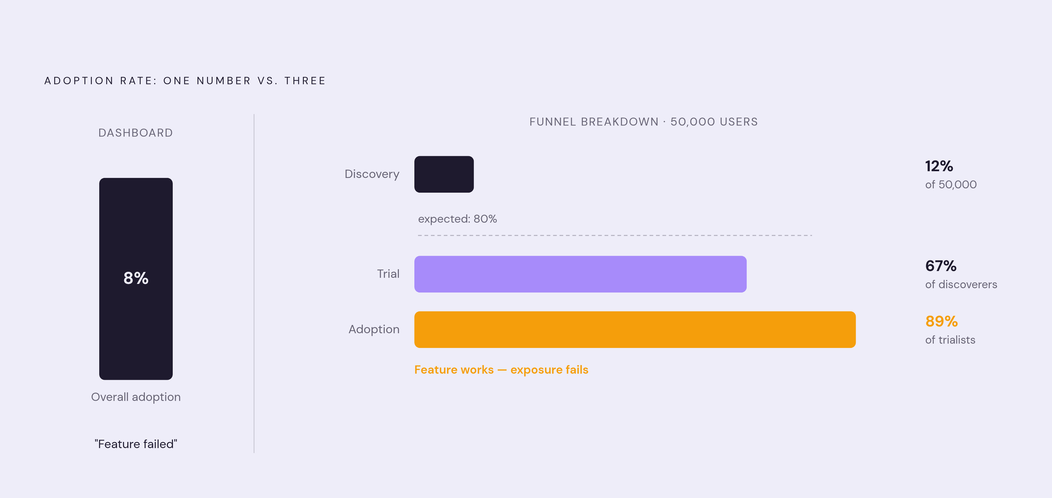
A case detailed in a Towards Data Science piece makes the stakes concrete. A feature showed a 12% discovery rate, which looks like a failure by almost any standard. But among the users who actually encountered the feature, 67% tried it, and 89% of those trialists went on to adopt it. The feature wasn't broken. The denominator was. For most recurring SaaS features, the right denominator is the active-eligible population.
What counts as discovery versus meaningful use
Discovery and meaningful use are not the same threshold, and treating them as interchangeable is where a lot of adoption metrics quietly go wrong. Discovery just means someone encountered the feature: they saw an announcement, landed on the right screen, opened the builder. Meaningful use means they finished the workflow and got the value the feature was built to deliver, like actually scheduling and sending a report rather than just poking around the report builder for thirty seconds.
The qualifying behavior needs to match the feature. A one-time integration setup, a tool someone opens daily, and an annual compliance workflow all deserve different thresholds for what counts as "real" use. One clean way to organize this is a four-stage funnel moving from initial exposure through activation, use, and repeated use.
This distinction changes what a raw event count actually tells you. A team tracking feature clicks is measuring exposure. A team tracking workflow completions is measuring something closer to value delivered. Same underlying data, same feature, wildly different numbers depending on which stage gets called "discovery."
Users versus accounts: choosing the right entity to count
This decision sounds like an afterthought, but it can flip the story completely. One power user inside an account does not mean the account has adopted a feature. And a feature can be adopted by most accounts while barely touching individual users within them.
Counting users makes sense for individual productivity features where each person's own behavior is the outcome that matters, for activation and onboarding work where time-to-value is personal, and for persona-level diagnostics where role drives the discovery pattern. Counting accounts makes more sense for expansion and renewal signals, since account-level adoption tends to predict revenue outcomes better than any single user's activity. It also fits features that require an admin to configure something before anyone else can touch it, and it fits reporting up to leadership, where the account is the real unit of business value.
The mixing error is easy to fall into and hard to spot after the fact: denominator set to accounts, numerator counting any user event inside those accounts. One active user out of fifty seats makes the whole account look adopted. The rate looks strong. The adoption is thin.
The measurement window: why the time boundary changes the number
The window isn't a filter applied after the fact, it decides who's even eligible to be in the denominator. Someone who joined after the window closed was never eligible. Someone who had no opportunity to trigger a seasonal workflow inside the window gets penalized for timing, not for behavior.
A few window types recur, each with a different job. A 30-day rolling window works well for recurring workflows and is the standard for most benchmark comparisons, since it normalizes across different signup dates. Post-first-login cohort windows, 7-day or 14-day, are built for activation and onboarding diagnostics, separating brand-new behavior from steady-state behavior. Lifecycle-relative windows ("within 30 days of becoming eligible") fit features gated by a plan upgrade or role change, where a plain calendar window misattributes who was actually eligible when. And opportunity-relative windows fit situational features, where the measurement period has to include at least one occurrence of the triggering event or the rate means nothing.
Research has shown that users who engage with a new feature in the first week show meaningfully higher six-month retention compared to users who delay discovery past 30 days. A single 30-day window can bury that distinction entirely, treating a day-2 discoverer and a day-29 discoverer as the same data point when they're not. Mixing rollout cohorts compounds the problem. Comparing early-access users against general-release users inside the same window stacks two groups with different amounts of time and different context on top of each other, and the resulting trend line tells you about the mix, not the feature.
A properly constructed rate versus a dashboard number
Running the same underlying data through different choices on eligibility, threshold, entity, and window produces a different conclusion, not a rounding error. One version says "adoption is low." A properly built version might say "discoverability is the bottleneck," which is an entirely different problem with an entirely different fix.
The Towards Data Science case makes this vivid. A B2B SaaS company with 50,000 users launched a major feature expecting 30% adoption in the first month. Two months in, adoption sat at 8%, a result that looks like a failed feature. Breaking the funnel apart told a different story: discovery rate was 12% against an expected 80%, trial rate among the people who actually discovered it was 67%, and adoption among trialists was 89%. The feature worked. Almost nobody found it. The feature worked, but almost nobody found it, so that is an exposure problem rather than a product problem, and no amount of redesigning the feature itself would have fixed it.
A properly constructed rate makes visible whether low adoption is a discovery failure or a value failure, which stage of the funnel is bleeding users, and whether the problem is spread evenly or concentrated in one role, one plan tier, or one signup cohort. What it still won't tell anyone: event volume, time spent, satisfaction, revenue impact, or whether the feature actually caused any retention gain. Those all need their own metrics. Adoption rate answers one question, not five.
Feature retention as the quality check on a discovery rate
A single-period discovery rate has a blind spot: someone who tries a feature once and never comes back still counts as an adopter. The number looks fine. The number looks fine, but the behavior producing it is not.
Feature retention closes that gap. It's the share of users who interact with a feature for the first time and return to it within 14 or 30 days, without a nudge or a reminder pulling them back. Pairing it with discovery rate produces a much sharper diagnosis than either number alone. Strong discovery paired with strong retention means the feature is working as intended. Strong discovery paired with weak retention points to a value failure: people found it fine, but the first session didn't give them a real reason to come back, and the habit never had a chance to form. Weak discovery, regardless of what retention looks like, means the fix is exposure, so there's no point trying to diagnose a feature nobody's finding.
Tracking feature-level retention separately from overall product retention matters because product retention hides exactly which features are pulling their weight and which aren't. That specificity is the whole point: a team can't act on "retention is fine," but it can act on "retention on this one feature is weak."
Segmenting discovery rates by role, plan, and cohort to find where to act
A single aggregate number can hide the exact place where a team needs to act. A feature at 40% adoption overall can be sitting near zero among the one segment that needed it most, and the blended average will never show that.
Three cuts tend to carry the most diagnostic weight. Role or persona is one: different roles reach a feature through different paths, and admins configuring a feature can accidentally block end-user access without ever realizing it. The Towards Data Science case found exactly this kind of pattern, where a segment mismatch between who discovered a feature and who needed it went undetected in the blended rate. Plan tier is another: features gated or partially available by tier will show systematically different rates across tiers, and a low rate on a paid tier is a fundamentally different problem than a low rate on a free tier. Signup cohort rounds it out. Users who joined before a feature launched and users who joined after it have completely different discovery contexts, and averaging them together erases a real difference between the two groups.
For context on what a reasonable rate looks like, one product metrics benchmark report puts average core feature adoption at 24.5%, with the top quartile clearing 45%. The number that should carry weight isn't the industry average, it's the rate against whatever success looked like when the feature was scoped. Benchmarks vary by category too: one feature adoption benchmark report found HR tech compliance features tend to land higher, in the 35 to 50% range, while performance management features tend to sit lower, around 15 to 25%. Even inside a single product, feature type sets the expected range.
The passive-versus-active discovery gap
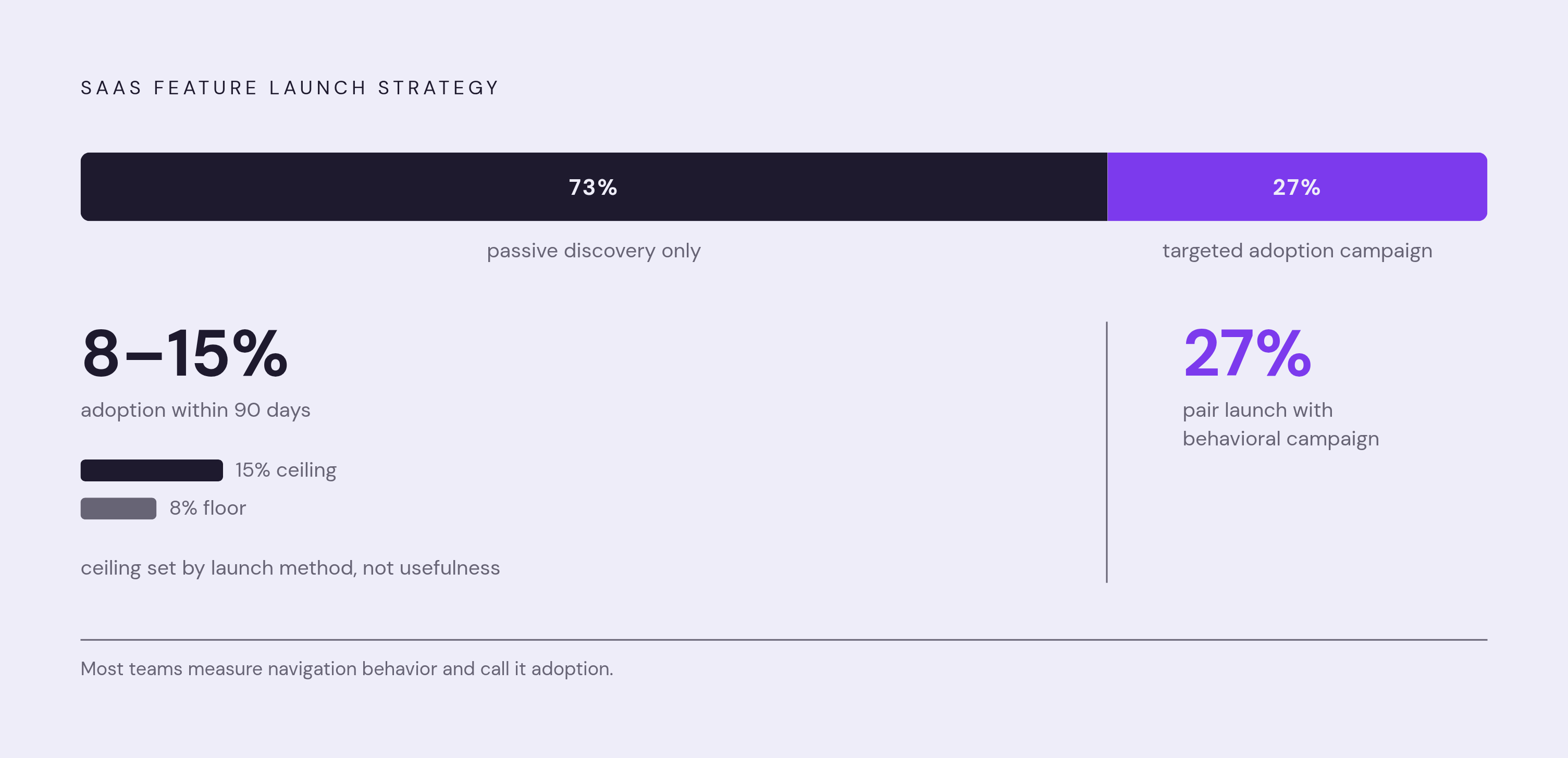
Most feature launches still rely on passive discovery alone, using release notes, an announcement email, an in-app banner, then waiting. One estimate puts 73% of SaaS feature launches in that passive-only category, with just 27% pairing a launch with any targeted behavioral adoption campaign.
That gap matters for what a discovery rate actually measures. A passively launched feature's discovery number mostly reflects who happened to be clicking around near the right part of the product at the right time. That's a navigation metric wearing an adoption metric's name. Passive launches tend to run in the 8 to 15% adoption range within 90 days, a ceiling set less by the feature's usefulness than by how it was introduced. Measurement design has to account for that difference, because a low discovery rate on a passively launched feature says something different than a low discovery rate on a feature that got a real, targeted push. Treating the two the same way produces an accurate number that answers a question nobody asked.