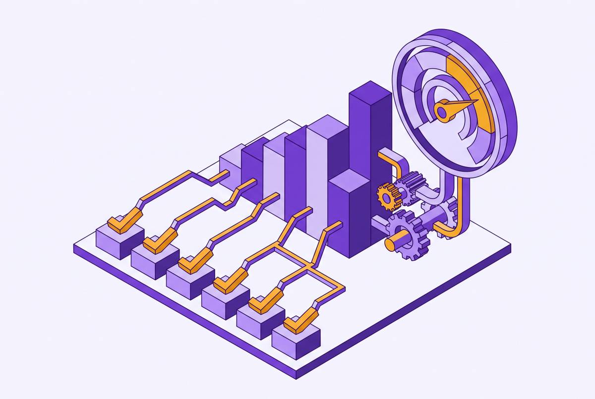
Activation Thresholds for Individual Features vs. Whole-Product Activation
Distinguishing whole-product activation from feature adoption prevents optimizing the wrong metric.

Most PLG teams are staring at dashboards full of green arrows and still losing customers they thought were healthy. Login frequency climbs. Tour completion rates look great. Button clicks trend up and to the right. None of it predicts whether the account renews, because none of it is activation, and most teams are optimizing metrics that feel like progress instead of the one metric that actually forecasts value.
Activation is a specific behavioral milestone that correlates with a user actually solving the problem they paid to solve. Only about 34% of PLG companies track activation as a defined metric, even though almost everyone in the room agrees it's the single most important number in product-led growth. That gap between belief and practice is where most measurement problems start, and it's the reason so many teams can't explain their own churn.
Activation isn't one thing, either. Whole-product activation and feature-level activation answer two completely different questions, and treating them as interchangeable is how a team ends up redesigning onboarding when the real problem is a single feature nobody was ever supposed to touch. A user can check every box in a setup flow and still churn, because checking boxes was never the thing that generates value.
What whole-product activation measures and why it has a single threshold
Whole-product activation marks the moment a user completes a workflow that demonstrates the actual value proposition. Not a proxy, not a tour, not a profile filled out completely. A specific, observable event appears disproportionately in accounts that stuck around, as seen when you look back at historical retention data.
The threshold is binary by nature. Either the user experienced the thing the product exists to do, or they didn't. There's no partial credit here. You crossed the line or you're still standing in front of it, and most of the accounts that churn are the ones still standing there, convinced they've already arrived.
The measurable form of this is time-to-value, or TTV: the stretch between account creation and the first meaningful value event. Instrument it as a timestamp difference, first value event minus account creation, averaged across a cohort. Where teams get this wrong is picking the wrong first value event. It has to be anchored to what historical data actually shows correlates with retention, not to something that merely feels like progress. Inviting a teammate feels like momentum. If it does not occur more often in retained accounts than in churned ones, it's not a value event. It's decoration, not a value event.
What feature-level activation measures and why it needs a different denominator
Feature activation doesn't sit underneath whole-product activation as some smaller version of the same question. It asks something else entirely: given that a user had a real reason to touch this feature, did they actually use it?
That "given that" clause is where most dashboards fall apart. Divide feature adoption by every signup, and any feature built for a narrow slice of users will look weak, even when it's working exactly as designed for the people who need it. A reporting feature built for finance admins will post a dismal adoption number if the denominator includes every free-trial marketer who never had a reason to open it. A reporting feature built for finance admins will post a dismal adoption number if the denominator includes every free-trial marketer who never had a reason to open it, and that's a broken denominator, not a weak feature. That's a broken denominator, and no amount of redesigning the feature will fix a math problem.
The fix is building the eligible cohort first: users or accounts with a genuine opportunity and a real job-to-be-done tied to that specific feature. Everyone else gets excluded from the math entirely, not just discounted.
Within that cohort, three states get conflated constantly, and they shouldn't be:
- Opened the dashboard. Exposure, nothing more.
- Saved a report built from live data. Real first-use evidence, someone did something with intent.
- Came back and repeated the action in the next workflow cycle. Durable adoption, the one signal that actually forecasts value.
Most feature dashboards stop at the first state and call it the third. That gap, between exposure and durable adoption, is where the confidence in a "successful" feature launch usually turns out to be fake.
Conflating the two thresholds produces the wrong intervention at the wrong moment
Two failure patterns occur constantly, and they run in opposite directions.
The first: a team sees low adoption on some feature and reads it as a whole-product problem. So onboarding gets rebuilt, tooltips multiply, a product tour gets bolted on. None of it works, because the eligible cohort for that feature was never defined. The number was always going to look bad, no matter how good the feature actually is, because the denominator was wrong before anyone touched the onboarding flow.
The second failure is the more dangerous one, because it hides behind a metric that looks fine. Whole-product activation is healthy. Retention looks okay this quarter. So the team assumes feature adoption must be fine too, and stops looking. Except a lot of those activated users are single-feature users: people who found one thing the product does well and never went further. That's a churn risk sitting in plain sight. If a cheaper competitor replicates that one capability, there's nothing else tying the account to the product.
Multi-feature adoption tells a different story. Users who pick up several core features build a kind of dependency that's hard to rip out. In one documented example, users who hit a defined aha moment, building a workflow with at least two steps within five days of signup, converted to paid at four times the base rate. That's not a marginal lift, and it says something structural: a product with a defined aha moment that converts at 4x has a moat. A product without one has a single good feature and a countdown clock, waiting for someone cheaper to build the same thing.
Defining activation thresholds in practice: how to set and sequence them
Whole-product activation gets defined by looking backward, never by guessing forward. Pull historical cohort data, find the earliest action that appears consistently in accounts that converted and stuck around, and confirm it appears rarely in the accounts that churned. That action is the anchor event. It's found, not hypothesized, and any team that skips this step is just picking a number that feels right.
A useful gut check for self-serve readiness: can a brand-new user reach that first value moment within 15 minutes, with zero help from a human? If not, the product isn't ready for a pure self-serve PLG motion yet, no matter how polished the landing page looks.
Feature activation thresholds take more steps to build correctly, and they follow a sequence:
- Define the eligible cohort. Who, in this period, had an actual reason to use this feature?
- Set a first-use threshold. Pick the specific action that counts as real use.
- Set a repeat-use threshold. Did the user come back to the feature during the next relevant cycle?
- Measure feature churn. If people adopt the feature once and abandon it fast, the value it delivers isn't durable, no matter how good the first-use number looked.
The sequencing across both thresholds matters as much as the thresholds themselves. Whole-product activation is the gate. Feature activation is what happens after someone's through the gate, deepening and expanding the value they already found. Fix the gate first, always. Spending energy optimizing feature-level adoption for a product that hasn't solved its whole-product activation problem is rearranging furniture in a house that's still missing a foundation.
What activation benchmarks tell you, and what they don't
Whole-product activation rates across B2B SaaS run roughly 25 to 40% at the median, climbing to 52 to 65% for top-quartile PLG products. That's a wide spread, wide enough that quoting a single industry number to a founder is close to meaningless without knowing the segment first.
The aggregate median across verticals is around 37.5%, but the gap between the strongest and weakest performing verticals changes the entire conversation. A FinTech team benchmarking itself against an AI/ML product is comparing itself to the wrong reference class entirely: the two operate under completely different constraints around trust, compliance, and how fast a user can even reach first value.
A benchmark can tell you whether there's a structural problem, sitting well below the segment median, or a marginal optimization opportunity, sitting near the top quartile already. It cannot tell you where to draw the threshold, which features belong in the eligible cohort, or whether the denominator in use is even the right one. Benchmarks answer how you're doing compared to others. They don't answer whether you're measuring the right thing. A spreadsheet full of industry averages can only ever answer the first question.
Turning activation signals into grounded, individual guidance rather than broadcast campaigns
All the measurement discipline above exists to produce something narrow and specific: a signal that one named person, on one known account, on one known plan, has or hasn't crossed a defined threshold. That's a fundamentally different kind of input than a segment-level statistic sitting in a quarterly report, and treating it like one is how good measurement gets wasted on bad outreach.
The useful move combines product events (someone crossing a threshold, completing a workflow, failing to return to a feature) with the current state of the account: plan tier, seat count, account age, role. That combination generates real context for the next best action. A drip sequence firing on day 14 regardless of what the account has actually done is a calendar pretending to be a product signal, and users can tell the difference within a couple of emails.
The eligible-cohort discipline from the measurement side has to carry through to outreach too. A message about a feature sent to someone who was never in the eligible cohort for that feature is noise. It's noise, and it teaches users to ignore whatever the product tries to tell them next.
Being included in an audience isn't, by itself, a reason to send anything. The same standard that requires a real eligible denominator in measurement requires a real evidence threshold before outreach goes out. If the evidence is thin, say nothing. Silence costs less than a message that trains someone to stop reading.