Instrumenting Feature Flags for Behavioral Analysis
Track behavior change after feature exposure, not just deployment success.
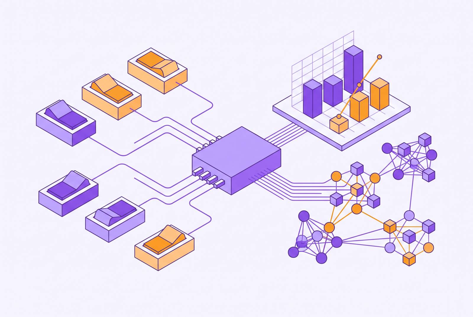
Feature flags run the release process at nearly every software company now, but most of that infrastructure stops at deployment. A flag decides who gets a feature and when it ships safely. It rarely tells anyone whether the feature changed what a user actually does, and that gap, not any shortage of deployment tooling, is the real problem. Most teams treat the flag as a release mechanism and nothing else, which is the wrong call: closing that gap turns a flag evaluation into the cleanest behavioral instrument most teams already own and never use.
Flags decouple code push from release, make rollback instant, and cut release risk close to zero. That's the deployment half of the story, and engineering teams have gotten genuinely good at it. The behavioral half, wiring a flag evaluation to what happens downstream in the product, gets built far less often. Teams know a feature shipped without breaking anything. They have no idea if anyone changed their habits because of it. Adoption research puts a number on how wide that blind spot runs: industry benchmarks place median core feature adoption at 16.5%, with an average of 24.5%, and a separate study of 181 companies found similar patterns in how users engage with core functionality. Most users of most SaaS products never touch the features their teams spent months building, and the flag was sitting at the exact point in the stack that could have explained why.
Why a flag evaluation is the right denominator for adoption measurement
A flag evaluation is a timestamped record of exposure: which user or account got access, and exactly when. That single fact solves the question that wrecks most adoption math before it starts: what the right group to measure against even is.
Measure adoption against total signups or total logins, and the denominator fills up with people who never had access to begin with. A free-tier user with no entitlement to a paid feature shouldn't count against that feature's adoption rate, yet plenty of dashboards include them anyway, dragging the number down for no honest reason. Use the flag itself as the boundary instead: distinct eligible users or accounts who reach meaningful use, divided by distinct eligible users or accounts in the same window, times 100. Anything looser than that isn't measuring adoption. It's measuring how big the userbase is, dressed up to look like the same question.
In B2B SaaS, the unit of measurement usually needs to be the account, not the person. Flags targeted at the organization level, enabled or disabled by plan, contract terms, or tier, naturally align with account-level adoption tracking. The same targeting logic that controls access can serve as the boundary for measurement.
The flag evaluation event is already firing somewhere in the system, on every single check. The instrumentation gap isn't missing data, it's that almost nobody joins that record to what the user does next. Without that join sitting in the event stream, there's no way to build a real funnel from exposure to discovery to trial to repeat use. The two halves sit in different places, unconnected, and the join is the entire point of this exercise.
The four decisions that define what your adoption rate actually measures
Adoption rate reads like one clean number on a dashboard. It's actually four separate decisions made at once, and most teams never write any of them down. That's exactly how two teams end up arguing over numbers that were never measuring the same thing in the first place.
The eligible population comes first, set by the flag's own targeting rules: plan, role, permission, account tier, beta cohort. Second is what counts as adoption at all, since a flag evaluating true is exposure, not adoption; somebody has to define the minimum action that signals real use. Third is which entity gets counted, and this one has teeth. A champion-only account, where one power user adopts and nobody else on the team ever touches the feature, looks statistically identical to a genuinely adopted account if the measurement only happens at the user level. Fourth is the time window: how long after exposure someone has to reach the adoption event before getting counted as a miss. Mismatched windows across cohorts make any comparison between them meaningless.
Time to First Action and Time to Value get treated as one metric far too often, and that's the wrong habit to keep. The first tracks how long after flag evaluation any interaction happens at all. The second tracks how long until the user reaches an outcome that's actually useful to them. Collapse the two together and a team loses the ability to tell whether it has a discoverability problem or a value problem, which call for completely different fixes, and no dashboard hands you that distinction for free.
Quality guardrails belong next to the adoption number, not off in a separate report nobody opens. Outcome success rate, error rate, time to complete, support contacts, dismissals or opt-outs: an adoption rate climbing while errors climb right alongside it isn't a win. It's a warning currently being ignored.
What repeated successful use looks like in the data, and why it is the real target
First use tells a team almost nothing on its own. Treating it as the finish line is the single most common misread in adoption reporting, and it's worth calling that out directly rather than softening it. What predicts whether a feature actually sticks is whether someone comes back to it, and how soon. Behavioral analytics research has found that features reaching repeated usage within the first seven days show retention at 90 days roughly 3.2 times higher than features where that repeat engagement gets delayed. Speed of the second use is where the signal lives, not the fact of the first one.
That points to a specific funnel worth instrumenting stage by stage: eligible (the flag evaluates true), exposed (the feature surface actually got seen), trial (first meaningful action taken), activation (the intended outcome reached), and repeat use (a second or third instance within whatever cadence is natural to the feature). Each transition needs both a raw count and a percentage, because the endpoint number alone hides exactly where the funnel bleeds people out.
A cohort view earns its keep here too, tracking retained feature use grouped by the week or month someone first hit meaningful use, matched to the rhythm the feature naturally runs on. Adoption rarely tells its full story from one feature in isolation, either: users who adopt two features together often convert at rates dramatically different from users who only ever touch one, and that combination often predicts retention better than either feature's adoption number does alone. It's how you find out which features are load-bearing and which are decoration.
Company size shifts the picture too. In benchmark data, mid-sized businesses with annual revenue between $5 million and $10 million show notably higher adoption rates, around 30.4%, while enterprise accounts and very small accounts behave differently enough that lumping them into the same bucket muddies the read. One caution belongs in every version of this analysis regardless of segment: watching behavior change after a flag evaluates true is not proof the flag caused the change. That kind of correlation needs an actual experiment, with control and treatment groups, before anyone gets to call it causal.
How to diagnose stage loss rather than just report it
The funnel above doesn't fail in one place for one reason. It fails at different stages for different reasons, and confusing those reasons is how a team ends up spending a quarter fixing the wrong problem entirely.
Low exposure paired with a flag that's clearly firing points to a placement problem, not a value problem: the feature exists, people are entitled to it, they just never see the surface where it lives. Strong exposure paired with weak trial is a different animal, a relevance failure, usually because the feature isn't showing up in the context of what the user is actually trying to do at that moment. Strong trial paired with weak activation is a UX or onboarding problem: people willing to try the thing but unable to finish it. Strong activation with no repeat use is a habit problem. The feature delivered value exactly once and never got tied into the user's recurring workflow.
Account-level analysis surfaces a failure mode all its own: the champion-only pattern, where the flag is true for the whole account but only one person ever adopts. That's a team-spread problem, and it stays invisible if the only lens is the individual user. No amount of user-level slicing will surface it; it needs an account-level breakdown instead.
Diagnosis sharpens with the right cuts: plan tier, role, account size, beta versus general release, acquisition source, and one segment teams love to skip, high-value accounts that never adopted at all. Each failure mode above calls for its own fix, and instrumentation only pays for itself once it routes each kind of failure to the person actually positioned to fix it.
Firing behavior-grounded guidance from flag state and product events
Most guidance systems make the same mistake. They schedule messages by day count instead of by what a user has actually done, and that's backward. Guidance should fire off behavior after flag exposure, not a fixed day-N drip that has no idea what the user did in the meantime.
Two sources of evidence need to work together here, and neither is sufficient alone. Product events capture what a user did, or just as often, failed to do. Database state captures plan tier, role, whether setup is complete, teammate count, permissions. Take a concrete case: a flag evaluates true for bulk export, but the user keeps exporting records one at a time, and the database confirms their plan and permissions do allow bulk export. That combination, behavior plus entitlement, is what justifies sending guidance on how bulk export fits what they're already doing. Later flag-tied events then confirm whether that guidance actually led to bulk export getting used successfully.
The sequence isn't optional: check the flag state, check the behavioral evidence, check the database state, decide whether guidance is actually warranted, then measure what happens in the product afterward. Skipping the message when the evidence is weak matters just as much as sending it when the evidence is strong. Reaching someone with guidance they don't need is how a team trains its own users to ignore everything it sends them.
Frequency caps, quiet hours, and never-contact rules need to live in the send logic itself, not get bolted on afterward as a compliance checkbox. There's a real line between guidance that feels useful and guidance that feels like surveillance: referencing a specific outcome someone was trying to reach is personalization, reciting their recent clicks back to them is something else, and users notice the difference immediately. The only real measure of whether guidance worked is what happens in the product afterward. Not an open rate. Not a click. Whether the flagged feature actually got used successfully once the message landed.
Where the flag evaluation fits in a PLG activation and PQL framework
Product-led growth is a standard motion at this point, but most implementations of it still fail at the one job that actually matters: connecting what a user does inside the product to what happens on the revenue side.
Flag evaluations are among the richest inputs available for building a product-qualified lead, because they record something more specific than a login. They record that a user reached a particular capability, one often gated by plan or tier, which makes it a far stronger intent signal than generic activity. A PQL is generally built from three dimensions: frequency of use, breadth of features adopted, and depth of engagement above some defined threshold. Flag data feeds all three directly.
Only a minority of PLG companies, roughly a quarter by some estimates, run a PQL framework today, which leaves a lot of conversion upside sitting on the table. Skipping this scoring layer is the more common choice, and it's the wrong one: where PQL-driven funnels do exist, they tend to convert free trials at somewhere around 25 to 30%, against single digits for leads that were never scored at all. Account-level flag data pushes this further into enterprise PLG territory: which departments adopted a feature, whether adoption spread across a team or stayed with one champion, how effective that champion actually was at bringing others along.
Most B2B buyers want two things that pull in opposite directions. They want to try the product on their own before anyone calls them, and they still expect a human conversation before they'll sign anything. Flag-grounded behavioral data is what tells a sales team which accounts are genuinely engaged and which features are driving that engagement, so the human conversation, once it happens, actually says something the buyer doesn't already know.
None of this is abstract. A modest gain in activation carries through into retention and eventually into monthly recurring revenue, and the instrumentation described across this piece is what makes it possible to know whether activation moved at all, instead of guessing. Segmenting accounts by what they've actually done, rather than by how long they've been a customer, tends to produce meaningfully better conversion and retention outcomes.
Choosing a feature flag tool that closes the instrumentation gap, not just the deployment gap
The question worth asking about any flag tool isn't whether it manages flags well. Most of them do that fine at this point. It's whether the tool connects flag evaluations to behavioral outcomes inside the same data model, or whether someone downstream still has to build that join by hand. That manual join is exactly where most teams' instrumentation quietly falls apart, usually months after anyone remembers deciding to skip it. A tool that manages flags beautifully but leaves that join to a future data engineer hasn't solved the actual problem this piece is about.
Statsig combines feature gates, dynamic configs, experimentation, analytics, and session replay in one platform, processing over a trillion events daily with 99.99% uptime and sub-millisecond evaluation latency. Its CUPED variance reduction cuts experiment runtime by 30 to 50%, and its Safeguards feature monitors business metrics and can roll back a problematic feature automatically. It offers a warehouse-native deployment option, unlimited free feature flags, and a free tier that includes 2 million analytics events and 50,000 session replays a month; OpenAI, Notion, and Brex are among the companies running on it. The tradeoff is real: a team that only wants basic flag toggles is paying, in complexity if not in dollars, for a lot of surface area it won't touch.
LaunchDarkly is generally regarded as the industry leader for flag management at scale, built around developer workflows and enterprise deployment. It offers real-time flag updates, granular targeting on custom user attributes, enterprise-grade role-based access control and audit logging, and its own analytics and experimentation tools. High-traffic environments should run the relay proxy to cut down outbound connections to its streaming service, and misconfigured targeting rules are a well-known source of unexpected rollouts there.
Optimizely Feature Experimentation grew out of A/B testing roots, combining controlled experiments with gradual rollouts across both server-side and client-side SDKs, with solid analytics for tracking how a feature performs once it's live. It fits teams that already run an experimentation culture and want that data-driven habit reinforced by the tooling. Split and Flagsmith both come up as comparison points for teams weighing a unified platform against more siloed tooling, with Flagsmith's open-source roots appealing to anyone who wants a self-hosted option next to a managed one. Unleash is fully open-source and suits teams with the infrastructure capacity and data-sovereignty requirements to run flag management themselves. Harness Feature Flags sits inside the broader Harness Software Delivery Platform, a natural fit wherever flag logic is already tightly bound to CI/CD. ConfigCat is the lighter option, developer-focused, for teams that just want flag management and nothing else attached.
WorkOS Feature Flags is built specifically for B2B SaaS, with organization-level targeting that turns features on or off for an entire company rather than one user at a time. Its JWT integration embeds flag state directly into authentication tokens, cutting out an extra API call, and it supports multiple environments with zero-setup integration for teams already running AuthKit. It's the strongest fit for teams whose real need is access control tied to contract terms or plan tier, not deep behavioral analytics, and it shouldn't get mistaken for a tool trying to be both.
The integration test cuts through most of the marketing here. A flag tool that doesn't connect to an analytics platform or event stream hasn't closed the instrumentation gap. It has moved flag management out of the codebase and into a dashboard, which isn't nothing, but it isn't the same thing, and teams that treat it as equivalent end up rebuilding the same manual join a year later. Cost has to get evaluated the same way, as one bill rather than three. Some enterprise flagging setups have been reported to run past $50,000 a month on evaluations alone at scale, which means flagging, experimentation, and analytics need to get priced together, not as separate line items that each look reasonable in isolation. What actually fits a given team comes down to a short set of real questions: whether behavioral targeting is needed or attribute-based targeting is enough, whether experimentation needs to live inside the same tool or can sit on a separate platform, whether the unit of targeting is the individual user or the whole organization, and whether the data already lives in a warehouse that wants a native connection instead of another export job.